Image Credit: Cherlynn Low / Engadget
Despite the limitations, I’ve been enamored with taking pictures on the Flip 4. It’s worth shouting out the open palm gesture that Samsung has supported for years that makes hands-free triggering of the camera much easier. And I have to be honest — I mean specifically shooting selfies and content for social media featuring me (and my friends). The Flip 4 is also useful for my video calls with my parents in Singapore, eliminating the need for a phone stand. None of this is new to this year’s Flip, by the way. I just wanted to remind you how much fun and function you can get out of a regular-sized phone that folds.
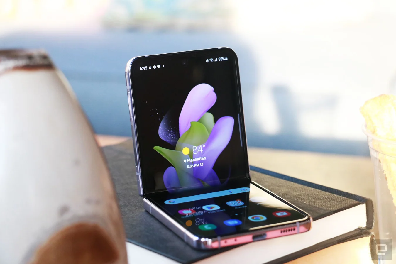
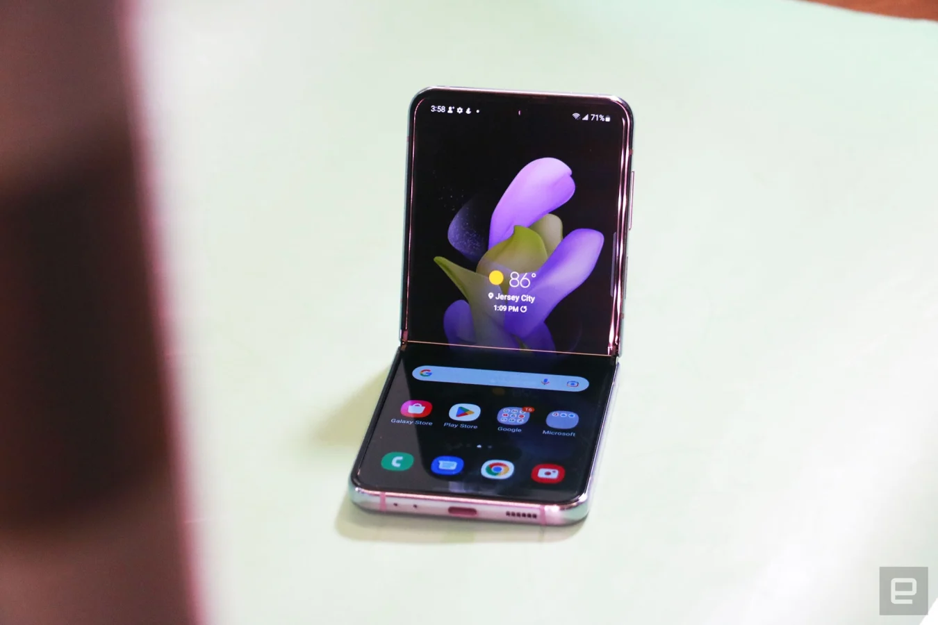
Samsung also offers an interface called Flex Mode that kicks in on compatible apps when the system detects the phone is open at about 170 degrees or less. In these situations, apps like Camera and Gallery turn the lower half of the screen into a touchpad that lets you swipe through pictures while displaying the content you’re viewing on top. YouTube, for example, will display the video on the top half, flanked by two horizontal black bars, while the title, views, details and comments sit in the bottom portion.
It’s mostly intuitive and useful but, man, I have such a love-hate relationship with Flex mode. I vividly remember thinking that using the Flip with one hand while leaning back on my couch would be easier if Samsung added its Flex Mode panel to more apps so I could easily scroll through long posts or articles. I was wrong.
On the Flip 4, Samsung introduced a Touchpad feature to its Flex Mode panel, which you can force enable for most apps even if their developers didn’t design a specific layout. You’d use this like it were a laptop trackpad on the bottom of your screen: move your finger around to control a cursor, tap to click links and other elements and drag two fingers up or down to scroll. You can’t pinch to zoom, but honestly that’s not a laptop-like gesture I need here.
Cherlynn Low / Engadget
In theory, a lot of this makes sense. When you’re using one hand and holding the Flip slightly folded, reaching for elements on the top of the screen with your thumb can be tricky. The trackpad makes it easier to click things at the edge of the panel. But two-finger scrolling in one-handed use simply does not work, unless you somehow can balance the Flip with just three fingers and have the dexterity to use your remaining digits to swipe on the screen.
Those of us without Olympian-level finger gymnastic skills will probably need to leave Flex Mode to scroll. Trouble is, there is no easy way to summon this panel. Worse, it reappears if you straighten and refold the screen, or if you jump to another app and return. I’ve lost track of the number of times I’ve hit the X to dismiss Flex Mode, only to absentmindedly open Telegram to reply to a friend, and be presented with the black box again.
To make things worse, the X icon to dismiss the Flex Mode box is right up against the crease, making it incredibly hard to hit. I usually have to tap it about five times to get it to register. Honestly the only thing the new trackpad is good for is dragging the cursor to the X to close itself.
To be clear, this panel only appears if you’ve gone into the experimental Labs area in Advanced Settings to enable it for specific apps. Most people are unlikely to encounter it by default, and the Flex Mode layouts for customized apps like Gallery and Camera are fine.
Cherlynn Low / Engadget
Cover display is slightly more useful
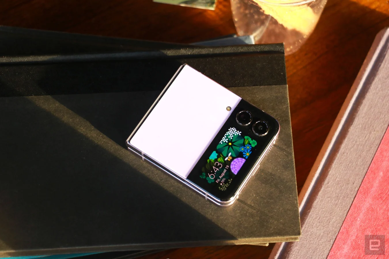
Samsung is also caught in a difficult situation when it comes to the external screen. This window is the same size as last year, and the company’s added a new widget so you can do more without opening the phone, like control your smart home appliances. The existing options were a media player, calendar, schedule, weather, alarms, timer, quick dial and health, which is really a glorified step counter. To make the cover display a bit more useful, Samsung also added the ability to quickly reply to messages using emoji, dictation or a selection of preset responses like “No thanks” or “On my way.” It’s basically what you get from a six-year-old Fitbit or smartwatch. The Apple Watch offers an onscreen keyboard for replies now, too, even if it’s hilariously and uselessly tiny. Still, I’m glad Samsung at least offers some options here, making the cover display at least slightly more functional.
The minimal functionality of the Flip 4 when it’s closed is a good way to partially unplug from distractions while still remaining reachable — kind of like using a pager (remember those?). Samsung’s new customizable clock face designs are adorable and make the device more attractive. I also appreciate being able to surreptitiously set a timer or snap a selfie when the Flip is small enough to hide in my palm — people are less aware of me taking my 900th selfie of the day when I’m using a tiny square instead of holding out a metal-and-glass slab of a phone.
Without increasing the size of the cover display, the company can’t really do much more. And I’m not sure I want Samsung to go bigger. A larger second screen would tax the battery, which is something the Flip 4 can barely spare. I’d much rather the company gave the next Flip better cameras.
Cherlynn Low / Engadget
Cameras
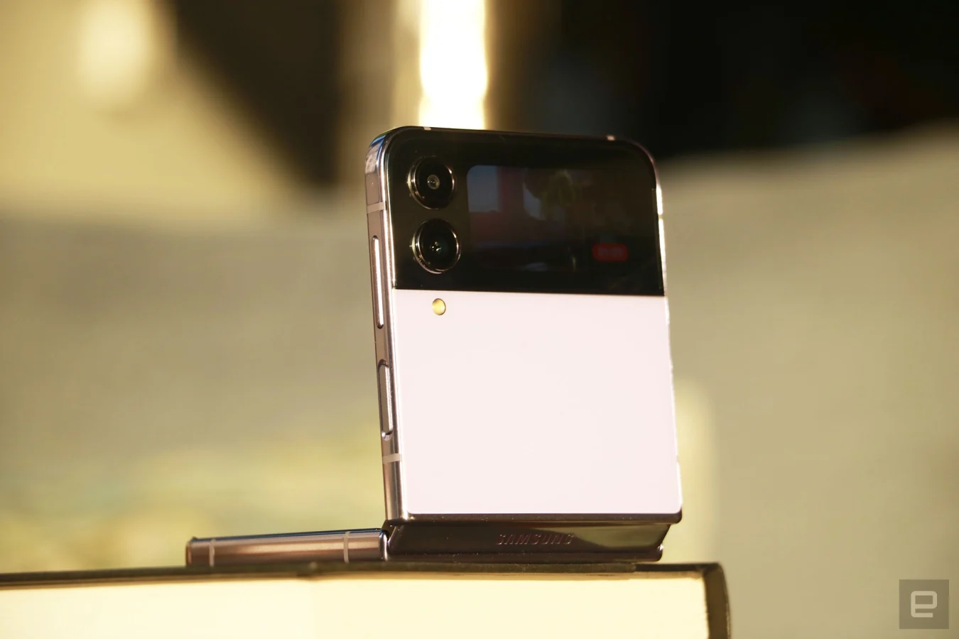
That’s not to say the Flip 4’s cameras are bad. They’re actually surprisingly capable — especially the pair of 12-megapixel sensors on the outside. With larger 1.8-micron pixels than the Flip 3, the primary and ultrawide cameras both delivered impressively colorful and sharp pictures that rivaled the Pixel 6 Pro and iPhone 13 Pro in bright light.
Like the Galaxy S22 Ultra, the Flip 4’s pictures were warmer and more saturated than the Pixel’s, but less red than the iPhone’s. All three handsets produced similarly sharp pictures of buildings at sunset, though Samsung’s images were occasionally a little soft. But they weren’t anything egregious — the bark on a tree I shot against the sun wasn’t as crisp on the Flip for example. But I wouldn’t have noticed if I wasn’t pixel peeping looking for the differences.
As usual, Google has the upper hand at night, with windows on the Empire State Building looking tack sharp, but slightly blurrier on the Flip 4. I also prefer Google’s approach to Portrait mode. The Pixel 6 Pro is better at identifying outlines of subjects and applying a blur to everything else. Samsung’s system is still hit or miss and can look artificial.
The iPhone and Pixel both offer better quality than the Flip on zoomed-in photos, especially in low light. While Apple and Google were able to retain generally clean lines in the faraway Manhattan buildings in a nightscape, Samsung’s picture was a muddy, blotchy mess.
Gallery: Galaxy Z Flip 4 camera samples | 31 Photos
Gallery: Galaxy Z Flip 4 camera samples | 31 Photos
Selfies I took in low light with the Flip 4 were similarly splotchy, but the Pixel and iPhone didn’t do much better in those situations anyway. I was pleasantly surprised by how sharp and warm the photos I captured with the Flip’s inside camera in daylight turned out, though. They looked more natural than the Pixel’s shots, and were about as good as the iPhone’s.
The videos I recorded with the Flip’s external cameras were also on par with the other two. Like a true fitness influencer wannabe, I set up the phone alongside the Pixel and iPhone and took copious videos of myself working out, and each time the Flip’s clips were about the same quality. One time, though, the Flip’s video was out of focus, which I think might have something to do with how I started recording. In general, most of the videos I shot with the Flip were smooth and vivid.
Performance and in use
Like any mainstream flagship phone, the Flip 4 is equipped with the latest top-tier Snapdragon 8+ Gen 1 chip and has 8GB of RAM. After some initial hiccups while setting up the phone, during which the Flip 4 got noticeably warm, things got smoother. I never encountered any lag as I shot videos, livestreamed to Instagram, screen-recorded my friends’ Instagram Stories or posted photos. It did get hot again when I called my parents via Telegram, but otherwise the Flip mostly remained cool.
It’s worth reminding you all that some apps struggle with the Flip’s uncommon aspect ratio. The biggest culprit is Instagram. Often, the create post button will be out of reach or overlap other posts. The Stories editor has a blank black strip at the bottom between the viewfinder and the submit buttons, and if you’re using Samsung’s keyboard, it sometimes obscures things like the color picker or tag suggestions. This isn’t a dealbreaker, but it’s a minor inconvenience to be aware of if you’re getting the Flip.
Cherlynn Low / Engadget
Thankfully the days of heavy-handed overlays like TouchWiz are mostly in the past, and Samsung’s phones now ship with fairly clean versions of Android and its One UI interface. There are pros and cons with this — I love Samsung’s Gallery app and the built-in video editor, for example. But I hate that Samsung occasionally still serves up ads in the notifications shade, showing you recommendations from the Galaxy App store. I also find that One UI doesn’t seem to understand Do Not Disturb mode, and frequently lets unnecessary alerts through. Still, the Flip 4’s software is not bloated and is fairly customizable, so you can alleviate some potential frustrations.
Battery life and charging
My biggest complaint about the Flip 3 was its dismal battery life, and it was the one thing keeping me from recommending it to a more mainstream user. With the Flip 4, Samsung not only used a larger 3,700mAh battery, but also a more power-efficient processor. The results aren’t astounding, but the Flip 4 generally lasts all day.
I usually take it out in the afternoon and come home past midnight with about 20 percent to spare. One Sunday, I took the Flip 4 to an early morning workout and ran around New York and New Jersey all day. By 10pm, it had dropped to 15 percent and was prompting me to enable battery-saving mode.
Cherlynn Low / Engadget
This is sort of pitiful compared to the battery life of the iPhone 13 Pro, Pixel 6 Pro and S22 Plus, which all stick around longer than a day. But given the Flip 4 has two screens, I’m willing to be more forgiving. Plus, when it came time to recharge the Flip, it didn’t take long — I usually got more than 40 percent of power in about 40 minutes.
On our video rundown test, the Flip 4 clocked 16 hours and 35 minutes, which is five hours more than the Flip 3 and, surprisingly, also more than the Nothing Phone 1. It’s even on par with the Galaxy S22+. Meanwhile, phones like the Pixel 6 and OnePlus 10T delivered results of more than 20 hours.
Wrap-up
With its improved battery life and durability, the Flip 4 is a more practical phone than its predecessor and is the first of Samsung’s foldables that’s truly ready for the mainstream. Sure, there are a few minor inconveniences to put up with, like Instagram’s incompatibility with its aspect ratio or the fact that it has considerably less battery life than other phones at this price. But if you’ve been itching to see if a foldable phone might fit in your life (and your pocket), or if you’re a selfie aficionado, the Flip 4 will be a satisfying purchase.
All products recommended by Engadget are selected by our editorial team, independent of our parent company. Some of our stories include affiliate links. If you buy something through one of these links, we may earn an affiliate commission.