Google’s plan to consolidate its communication services into Meet was supposed to (finally) make things simpler and more straightforward. It was meant to bring about some sense and order for a company that has always overthought this stuff and made it confusing — to a truly impressive degree. Earlier this month, the company rebranded its Duo video chat app as Meet and brought over Meet’s features. That left the original, to-be-phased-out Meet app with a new “Meet (Original)” name. It also made for an all-time great headline.
But apparently, not all customers have been happy with Duo’s sudden identity change. With the latest update to the Meet app for Android, Google has brought back the original Duo icon and name as a separate shortcut that appears in the app launcher. Tapping on Duo opens Google Meet. So you’ve now got two ways of accessing the same application.
Google told 9to5Google and Droid Life that it made this move intentionally so that users would be able to launch Meet by searching for “Duo,” just like they had done before it was rebranded. But the fact that this was even necessary again points to a company that has lost the thread on strategy around these services.
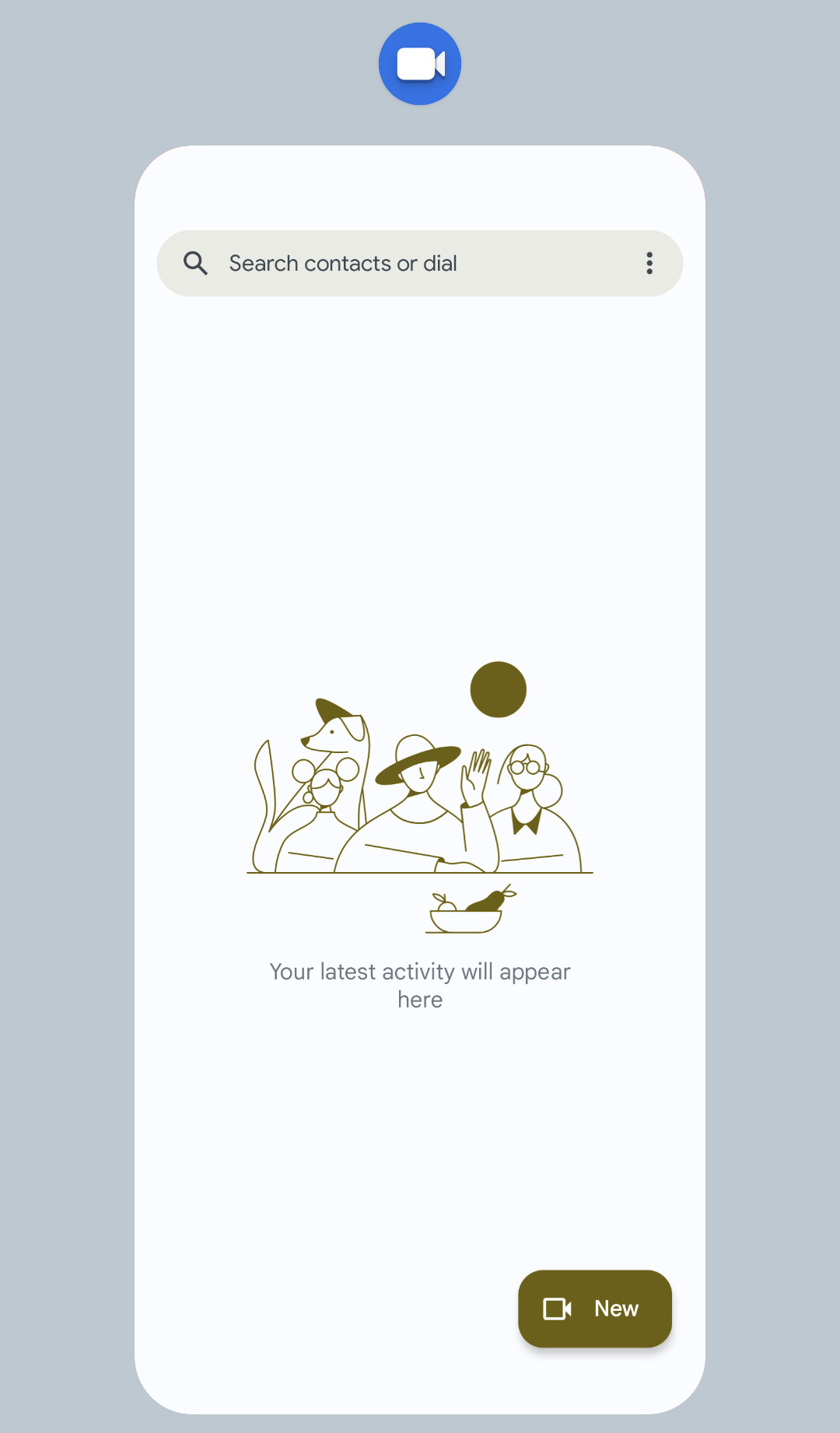
The Duo shortcut might be helpful to ease the transition, but it also opens the door to more confusion — especially when Google itself is telling everyone to “look for the Meet name and icon as your one app for video calling and meetings.” That’s not exactly the case anymore, now is it? We’re back to two icons and two names for the same app. And if you open up the multitasking view after launching Meet via the Duo shortcut, you’ll see Duo’s icon up top like so:
:no_upscale()/cdn.vox-cdn.com/uploads/chorus_asset/file/23973451/Screenshot_20220826_131524.png)
Great job, everyone. No notes. Someday we’ll end up with just Messages, Google Chat, and Google Meet after all of this — sadly, without the clean, simple FaceTime alternative that Duo once was — but the road there is proving quite convoluted.
I’m really glad it’s Friday.
