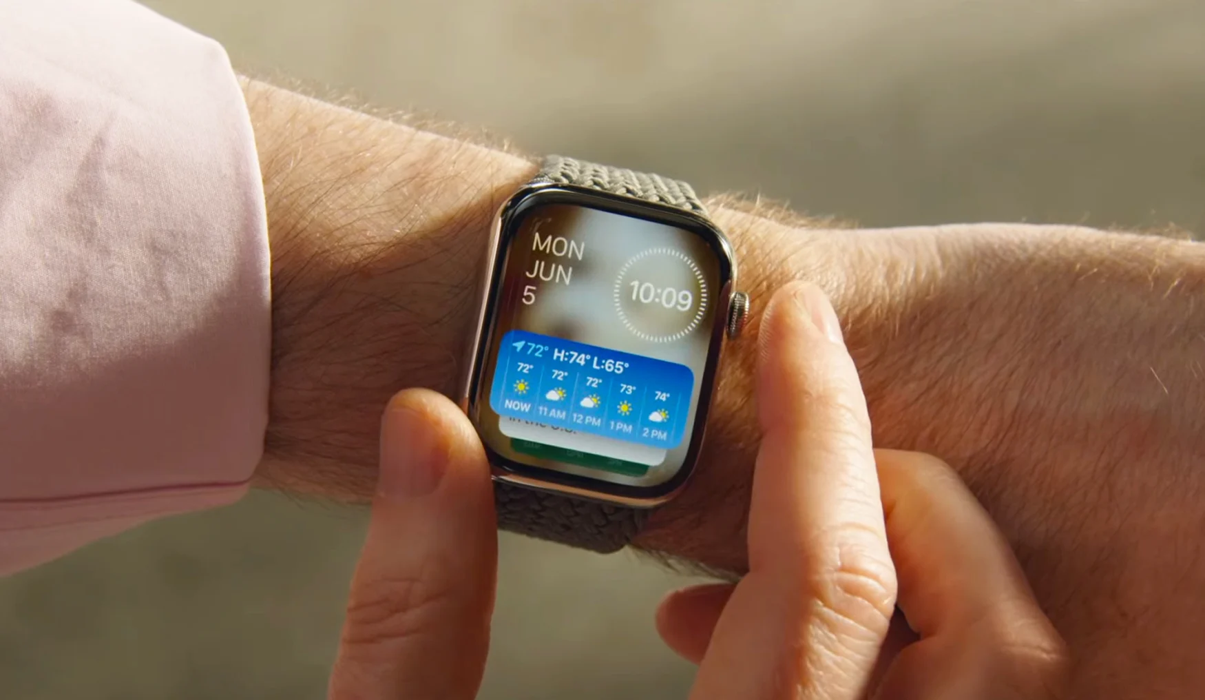
Apple is reorienting the user interface around a new version of the old Glances feature.
Your Apple Watch will look very different in the near future. Among the many announcements Apple made during its WWDC keynote was one related to watchOS 10. As expected, the company is giving the smartwatch user interface an overhaul as part of perhaps the firmware’s biggest update yet.
You may recall that the original Apple Watch UI was designed, in part, around Glances — a carousel of widgets for different apps and features. Apple eventually moved away from Glances to place more emphasis on apps, but now the company is looking to make widgets a larger focus of the Watch interface again.

Apple
It seems to work in a similar way to the Siri watch face that’s long been available on Apple Watch. However, this experience will now be available on any watch face. You can rotate the crown to access a Smart Stack of widgets — just like you’re able to cycle through widgets that you place on top of each other on iPhone.
This story is developing, please refresh for additional updates.
Follow all of the news from Apple’s WWDC 2023 right here.