There isn’t a singular headlining feature, but a lot of smart tweaks and updates.
Just a year ago, Apple announced the biggest software update the iPad has ever seen. iPadOS 16 ushered in Stage Manager, a completely revamped multitasking mode that brought overlapping, resizable windows to the iPad, along with robust external display support (provided you had compatible hardware).
There were a host of other new features, as usual, but Stage Manager in particular brought the iPad closer than ever to a Mac or Windows PC experience. iPadOS 17, on the other hand, is a more subtle update. That’s usually the case, with one year bringing big new features and the next offering tweaks and stability improvements. And while there isn’t one singular headline feature in iPadOS 17, the totality of myriad smaller changes definitely adds up. I’ve been using iPadOS 17 in beta for a few weeks, and now that the public beta is live, you can do the same.
A note on stability: Even though this is a public beta, the “beta” still applies. It’s probably not ideal to install on a machine you rely on for daily use, as you’ll surely run into some bugs and crashes. And it’s always a bit of a crapshoot how well third-party apps work on a beta. All that said, I haven’t run into anything particularly severe. Occasionally, an app will just toss me back to the Home Screen, or you might find some weird UI issues where apps haven’t quite been optimized yet. But over the last few years, Apple has gained a reputation for releasing public betas in solid, usable states, and that’s the case here as well. Just remember that “downgrading” to iPadOS 16 final releases isn’t exactly a simple process.
Stage Manager updates
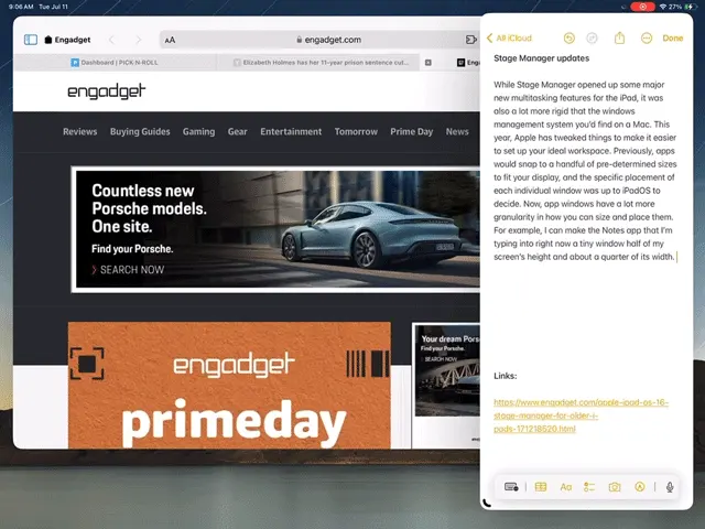
While Stage Manager opened up some major new multitasking features for the iPad, it was also a lot more rigid than the windows management system you’d find on a Mac. This year, Apple has tweaked things to make it easier to set up your ideal workspace. Previously, apps would snap to a handful of predetermined sizes to fit your display, and the specific placement of each individual window was up to iPadOS to decide. Now, app windows have a lot more granularity in how you can size and place them. For example, I can make the Notes app that I’m typing into right now a tiny window half of my screen’s height and about a quarter of its width. From there, I can make it as tall or wide as I want; there are still specific sizes that it snaps to, but there’s far more flexibility than there was last year.

iPadOS 17 is also a lot more flexible about how you arrange multiple apps, something that wasn’t the case last year. When you added a second app to a space, iPadOS automatically decided where the two windows should go. You could resize them both as you wanted, but it was basically impossible to show two apps side-by-side without any overlap, for example. That’s no longer the case. Now, it’s a simple matter of grabbing the top of a window and dropping it where you want.
These basic controls have been available on Windows and macOS for decades, but it’s still a new paradigm for the iPad. I’m definitely glad that Apple seems to be trusting its users more by giving them more flexibility rather than letting iPadOS make major decisions about how you lay out your screen. Stage Manager is still somewhat of a niche feature, given that lots of iPads can’t run it, but people who want to push their iPads further will definitely appreciate these updates.
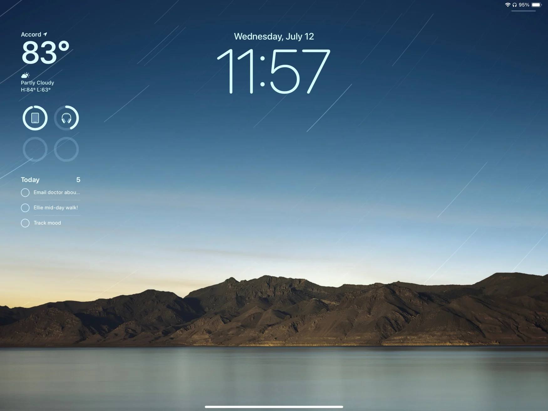
Probably the most obvious user-facing update is the revamped Lock Screen. It should also be very familiar, because Apple first introduced it on the iPhone a year ago. Basically, you can now set up multiple lock screens, each with its own wallpaper, widgets and design elements (like fonts and color filters). To jump between different styles you’ve set up, you can just press and hold on the Lock Screen and then choose what suits you. Finally, you can also set a specific Focus setting for each Lock Screen, so you can set up a whole profile for work mode or vacation time.
There’s also a great new wallpaper picker – this, too, borrowed from the iPhone. There are some new styles here specifically for the iPad, though, including striking views of every planet in the solar system stem. And in a nod to the iPad’s history, they brought back the original Pyramid Lake wallpaper (shot by photographer Richard Misrach) from the first iPad back in 2010. I’m a sucker for nostalgia and love the photo, so Apple won me over here.

Beyond the aesthetics, having widgets on the Lock Screen makes the iPad’s large display more useful — there’s a ton of space, so why not show more than just the time and your notifications? But widgets are getting a big improvement beyond just being able to drop them on the Lock Screen. At long last, they’re interactive. That means if you have a Reminders widget, you can tap a specific item to check it off without having to open the app. Or, with the Apple Music widget, you can automatically start playing an album or playlist.
Previously, widgets let you tap specific parts to jump to that place in the app, so they weren’t just static information displays, but this takes their functionality a lot further. We’re going to need third-party developers to add this functionality to their widgets to really take full advantage of the feature, but I’m looking forward to seeing how apps incorporate it when iPadOS 17 is out in the wild.
Health
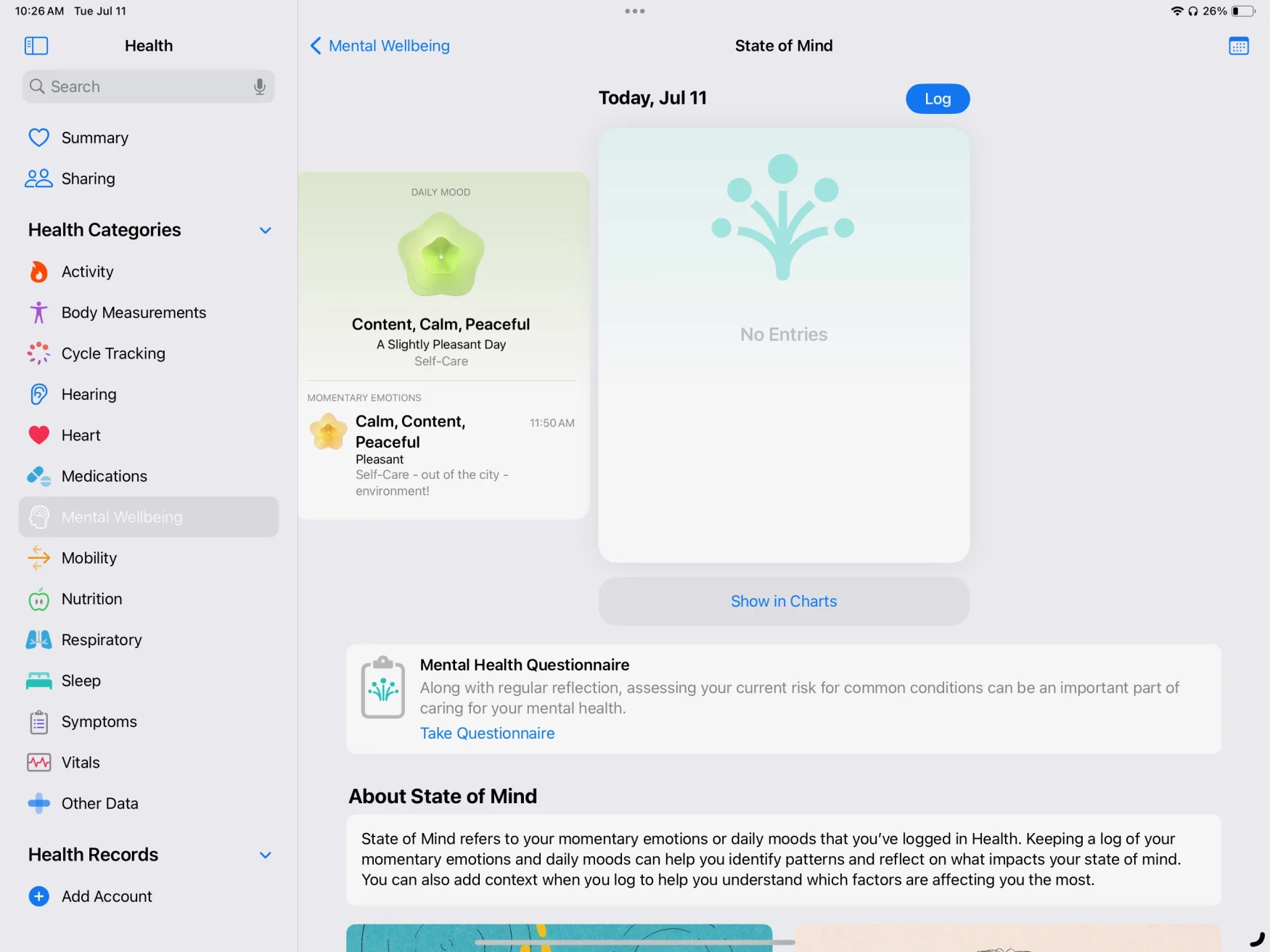
There aren’t many Apple apps on the iPhone that you can’t also get on the iPad. Health was one, but that’s been remedied this year. It’s just what you’d expect: Health data tracked from your iPhone and Apple Watch is available for you to review on the iPad, with a design that’s better suited to the larger screen. While there’s nothing revolutionary here, the Health app can include so much data that it’s actually a bit easier to dig through everything here.
Everything syncs from your iPhone, but so far that sync process hasn’t been the most reliable. Even though the Health app on my iPad says it synced two minutes ago, it hasn’t pulled in updated steps data since 7AM this morning. My activity rings from my Apple Watch are similarly hours out of date. I wager this will get settled before iPadOS 17 is finished, though.

Apple announced a handful of features relating to mental health as part of the latest iPad and iOS updates, including a dedicated journaling app and mood trackers in the health app. While the journal app isn’t coming until “later this year,” sometime after iPadOS 17 and iOS 17 officially launch, the mood tracking features are available in the Health app. I’ve long been in the habit of tracking my daily mood, and this isn’t a bad place to do it. It’s pretty simple, with a slider to pick your overall mood and a few follow-up questions, but the idea is for it to be quick and painless so you do it repeatedly. There’s also a mental health questionnaire you can take that claims to assess your anxiety and depression levels that reminds me of questions I’ve answered from a doctor in the past. I did reach out to Apple to find out where they’re sourcing this set of questions from so we can know more about their validity and approach.
Safari, Messages, Notes and more
As always, Apple’s core apps are getting lots of little but potentially meaningful updates. Safari’s biggest new feature is arguably the ability to set up multiple profiles. Each profile can access all your bookmarks, saved passwords and reading list, but it keeps things like logins to sites and tab groups separate. I did the basic “personal and work” profiles, with logins to work-specific tools kept separate. It’s also pretty easy to move things between profiles if you accidentally open windows in your personal profile that you’d rather have with your work tabs. And, of course, this all syncs via iCloud to other devices — I have the macOS Sonoma beta installed as well, and things were shared seamlessly.
Messages is possibly Apple’s most important app, and every year it gets usability tweaks and new features. A bunch of those are focused around audio messages, which I haven’t really had a chance to check out much. One thing I do like, though, is that replying in a thread is a lot easier than it used to be. Now, swiping right on a message opens the reply interface, which is definitely quicker than holding down on a message, waiting for the menu to pop up and selecting the “reply” option.
The search experience has also been upgraded with filters. For example, you can first search for a specific contact, and then search just their conversation for keywords. The results naturally include specific messages as well as relevant links, images and more.
But the update I’ve had the most fun with so far is definitely Stickers. You can now easily create your own stickers from images in your photo gallery. If you tap on a subject in a photo, you can pull it out from the background and save it as a sticker, so you can easily use it again. Live Photos can be turned into live stickers — and let me tell you, the live sticker I made of my dog laying down is adorable and I will spam everyone with it.
Your own stickers can live alongside sticker packs from other apps, emoji and Memoji. And the stickers you’ve created will be available to use in third-party apps, as well. Basically, stickers you create as well as those from apps should be easier to share outside of just Apple’s Messages app, which is a nice change from the previously walled-off approach Apple took.
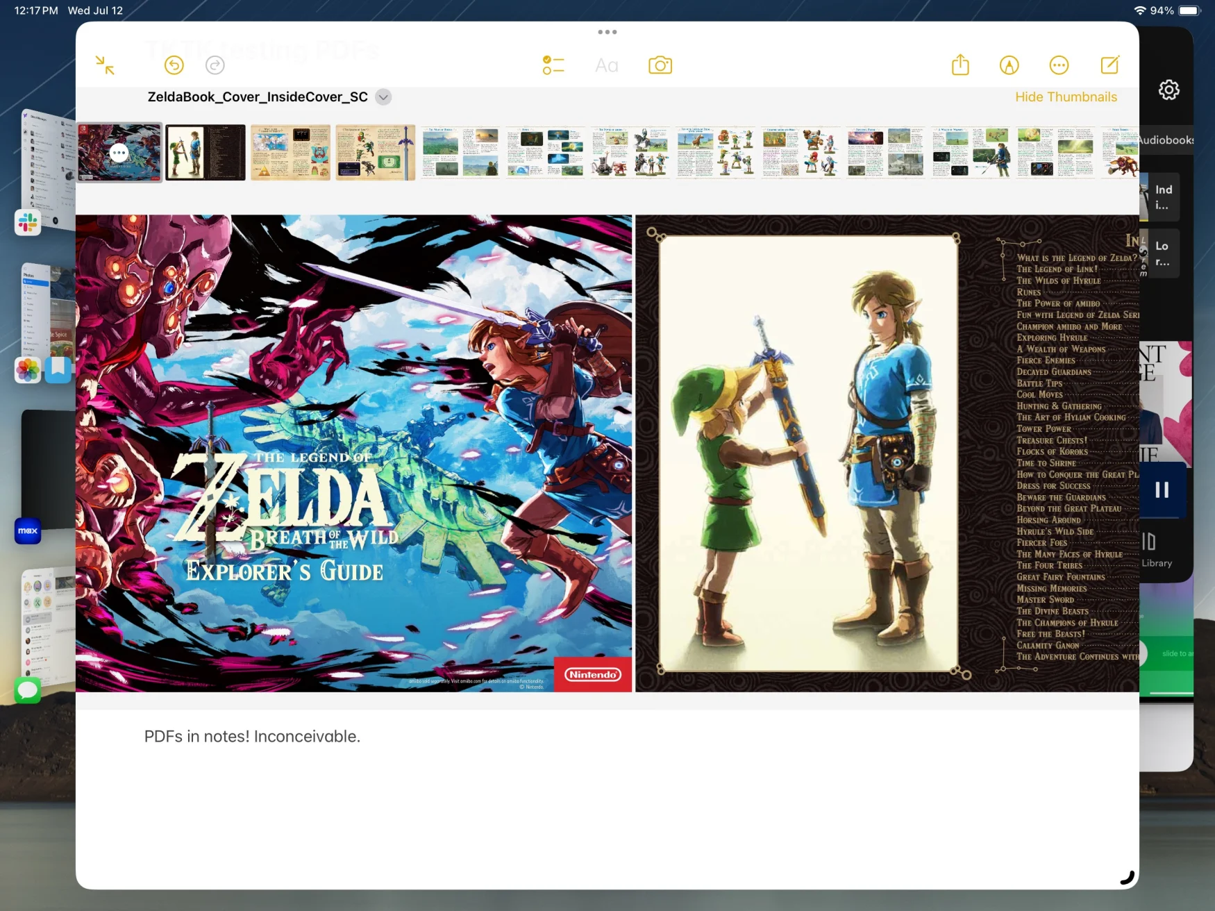
Notes, quietly one of Apple’s most useful apps, has gotten more improvements this year too. You can now embed PDFs right into a Notes doc and they display full-width, so you can easily browse through a PDF and make notes on it below. You can also naturally mark it up with an Apple Pencil or collaborate on it in a note shared with other people.

PDF support system-wide has been improved. For example, opening a PDF document from the Files app will open it in its own window, provided you’re running Stage Manager. This makes it easier to put a PDF side-by-side with another app while still having full access to the Files app. Auto-filling fields in PDFs has also been improved system-wide; Apple says it’s using an on-device neural network to identify documents that have fields that need to be filled in across the system, and you’ll be able to AutoFill details like names and addresses the same way you can on websites.
Another useful trick is the ability to link directly to a specific note in your library. Other note-taking apps like Bear have had this feature for a while, but it’s undeniably handy to link related notes together so you can easily jump between them instead of having to go back to the sidebar and search for the one you’re looking for.
The rest
This just scratches the surface of iPadOS 17. Lots of new features, like the changes to Messages, work best when other people you know are also running the new software. And other things, like the journal app, won’t be available to try for months to come. Finally, there are plenty of iOS 17 features like Facetime updates and a smarter keyboard will be in iPadOS 17 as well. If you want to give this all a shot months before Apple finalizes everything, you can install the iPadOS 17 public beta now. But as always, think hard about whether you’re up for some instability before you take the plunge.
All products recommended by Engadget are selected by our editorial team, independent of our parent company. Some of our stories include affiliate links. If you buy something through one of these links, we may earn an affiliate commission. All prices are correct at the time of publishing.