/
We’ve been busy shaping our habits and thinking around our phones. But what would it look like if they shaped themselves to better fit our lives?
Share this story
:format(webp)/cdn.vox-cdn.com/uploads/chorus_asset/file/25304628/DSC06782_processed.jpg)
Mobile World Congress, like any good trade show, tries to present us with the best of what’s possible now and a vision for what’s coming next. Which translates to a lot of questions, particularly about the future of phones, like:
“What if phones, but controlled with your eyes?”
“What if phones, but make them fashion?”
“What if phones, but on your face? Or in your car?”
“What if phones, but color-changing for no reason?”
Honestly, this is the stuff trade shows are made of, and I absolutely love it. Where else are you going to see a transparent laptop? Definitely not at Best Buy.
But this year’s show seemed centered on one particular question: what does it look like for our mobile technology to bend itself to fit our lives a little better? I saw a lot of responses to this question over the course of a few days — from the extremely literal to the wildly impractical. And as expected, I have a lot more questions than answers about it all.
:format(webp)/cdn.vox-cdn.com/uploads/chorus_asset/file/25312884/IMG_779EE3DF27EE_1_processed.jpg)
Let’s get one thing out of the way: the app-less phone has apps. For now. At the bright magenta booth of Deutsche Telekom, I got a demo of an “app-less smartphone” from a startup called Brain.ai. The long-term vision is to have no apps, but what founder and CEO Jerry Yue shows me is an interface that lives on top of the OS, almost like a digital assistant. It starts as a kind of blank page, and once you ask a question or make a request, the system builds an interface suited to your purpose.
The UI also changes as you interact with it — tap on a search result and ask for a video, and it will react by adding a video module in the middle of your results page. No jumping between webpages or apps; it all just flows into a single page. Yue explains this by comparing it to the early mainstream internet, where instead of starting with Google and just searching for the thing we needed, we went to Yahoo and sifted through topic categories and drilled down to find what we wanted.
That makes a lot of sense to me. Through assistants and things like Snippets, OS and search interfaces have gobbled up basic functions you might have once turned to a dedicated website or app for. If I need to figure out currency conversion, I don’t download a special currency converting app or, god forbid, do math, I just type it into Google or ask Siri.
It’s the same reason a lot of today’s students don’t think in terms of file structures the way we used to — rather than navigating a directory of nested drawers, everything’s just in one big bucket. An interface that generates itself around your needs feels like the next logical step.
:format(webp)/cdn.vox-cdn.com/uploads/chorus_asset/file/25304633/DSC06787_processed_alt.jpg)
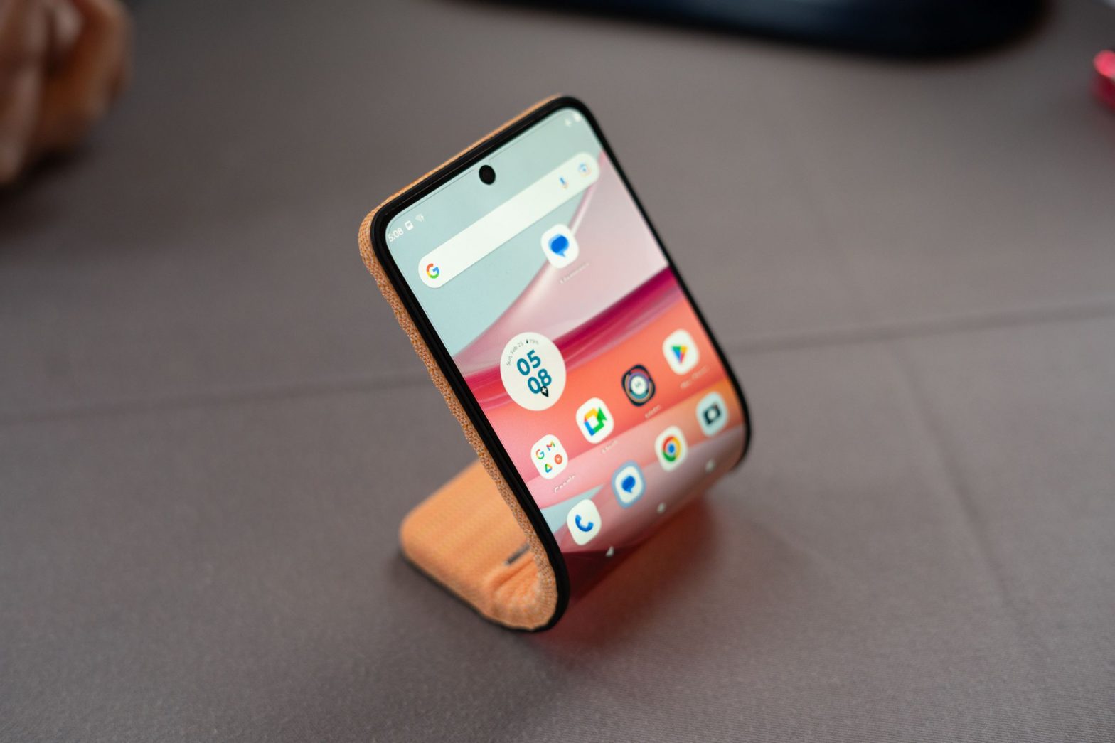
Motorola’s bending phone concept comes at the same question in a truly literal sense. The device isn’t a final product and is very unlikely to become one, but Bendy Phone (my name, not Motorola’s) is kind of a metaphor for what Brain.ai wants to achieve: What if our mobile tech weren’t so rigid? What if it could change shape and adapt to what we need in the moment?
Bending the Bendy Phone felt wrong every time I did it. Phones are more durable than they once were, but we’re still used to babying them to an extent. Grabbing a phone and pressing your thumbs into it until it bends backward feels like you’re doing something you shouldn’t. But it worked, and no Bendy Phones were harmed.
For the purposes of the demo, Motorola paired the phone with an adjustable magnetic band so the phone can be worn around your wrist as a watch. It’s extremely hard to imagine that this is the future shape our smartphones will take, but it’s an interesting exercise. Plus, I love a bit, and boy, is this phone ever committed to the bit.
:format(webp)/cdn.vox-cdn.com/uploads/chorus_asset/file/25307260/DSC06940_processed.jpg)
For a phone show, wearables really turned out for this year’s Mobile World Congress. The Humane AI pin made an appearance, and while there are a lot of interesting tech ideas wrapped up in this fascinating gadget, it still feels like a wildly impractical way to check your email or get directions to a cafe.
The Galaxy Ring — notably also not a phone — was one of the big stories to come out of this phone-centric trade show. But it’s mobile tech in the truest sense of the phrase, and it’s a promising extension of the smartwatch that’s less intrusive and better adapted to everyday life, for people who want such things.
Ridiculous tech demos aside, it does feel like we’re at a turning point in mobile tech — our Yahoo era is coming to an end. Our phones and wearables should integrate with our daily lives better, right? There’s no clear winner yet, though, just a lot of competing visions.
The concept that wins out might be a mashup of things I saw at this year’s show — wearables with lasers, AI-driven assistants, phones with fluid interfaces, and screens that flex. For now, we’ve seen some fun tech at this year’s show, and I think we forget that gadgets can just be fun.
As for what comes next, it’s hard to say. But I have plenty of questions in the meantime.
Photography by Allison Johnson / The Verge
