/
The company’s new branding aims to match its ‘activist spirit’ and distinguish Mozilla from its Firefox web browser.
Share this story
:format(webp)/cdn.vox-cdn.com/uploads/chorus_asset/file/25637393/Mozilla_brand_update_hero.jpg)
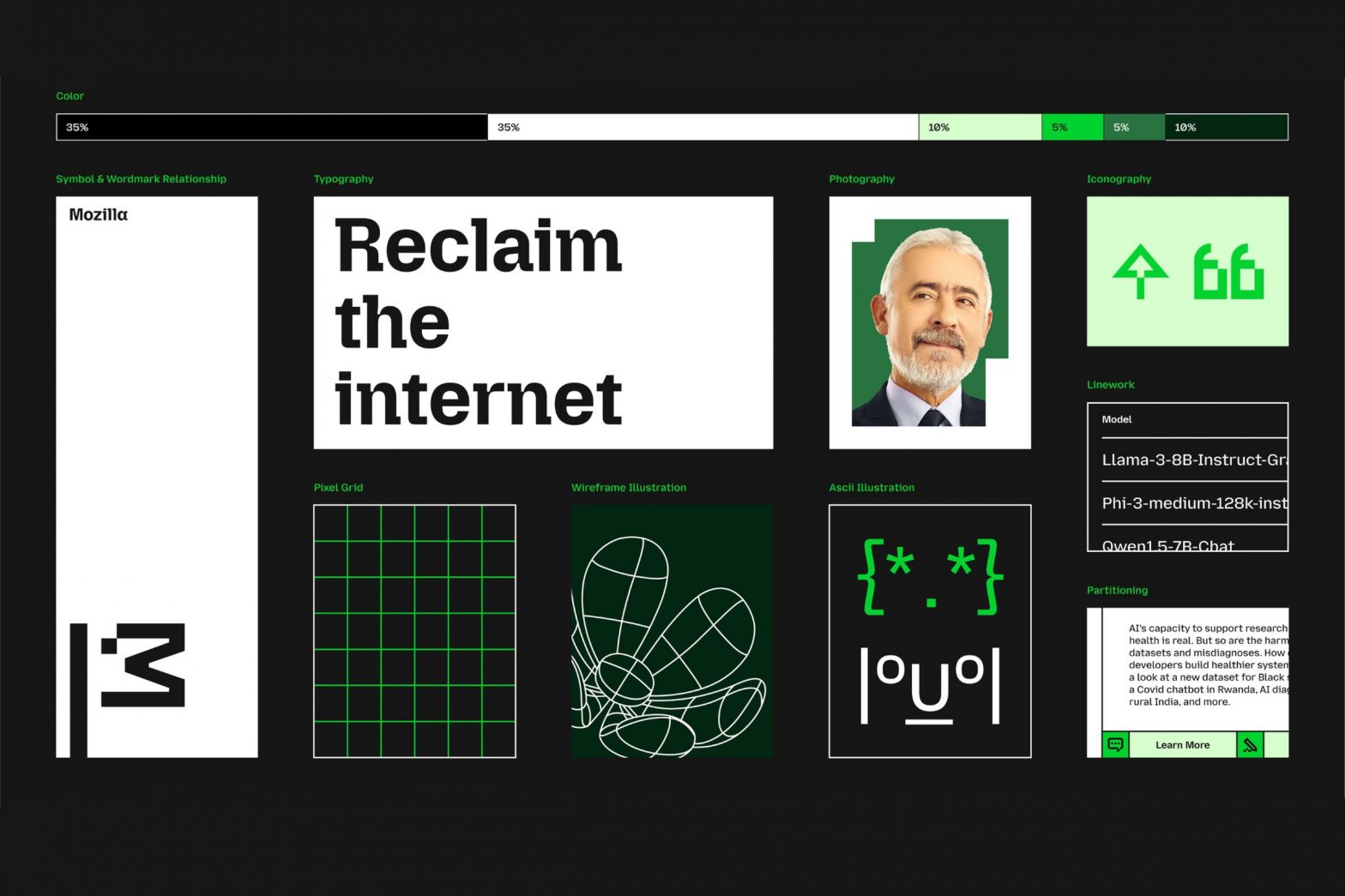
Mozilla has overhauled its branding to pay homage to its Netscape roots and better distinguish the wider organization from its Firefox web browser. The most notable change is to the company’s logo: what was previously a sans-serif wordmark styled as “Moz://a,” has been updated to correctly spell out the Mozilla name, featuring a new customized typeface and an M-shaped flag.
According to Mozilla, the flag symbolizes the brand’s “activist spirit.” That fits with the image that the Mozilla Foundation which is leading the company is attempting to build: describing itself as “a non-profit organization that promotes openness, innovation, and participation on the Internet” and regularly releasing privacy reports that investigate tech companies’ policy and security practices.
:format(webp)/cdn.vox-cdn.com/uploads/chorus_asset/file/25637383/01_MOZILLA_TOP_10_LOGO_BEFORE_AND_AFTER.jpg)
“We intentionally designed a system, aptly named ‘Grassroots to Government,’ that ensures the brand resonates with our breadth of audiences, from builders to advocates, changemakers to activists,” said Mozilla’s brand head Amy Bebbington. “It speaks to grassroots coders developing tools to empower users, government officials advocating for better internet safety laws, and everyday consumers looking to reclaim control of their digital lives.”
And our previous suspicions were correct: the oddly-placed dot on the flag logo serves as a throwback to the original Tyrannosaurus Rex “Hack” poster that Shepard Fairey designed in 1998. “The flag can transform into a more literal interpretation as our new mascot in ASCII art style, and serve as a rallying cry for our community,” Mozilla Foundation president Mark Surman told The Verge.
:no_upscale():format(webp)/cdn.vox-cdn.com/uploads/chorus_asset/file/25637389/Mozilla_new_logo_wordmark_animated_dinosaur.gif)
The firetruck red used in the old T-Rex logo isn’t returning, however. Instead, Mozilla is using a mix of saturated green, pink, and orange (with the latter acting as a subtle nod to the popular Firefox browser) to inject a pop of color against a white or black base. That, alongside the custom Mozilla Semi-Slab, Mozilla Sans, and Mozilla Sans Text typefaces, will replace the branding Mozilla introduced back in 2017, alongside some techy design elements like 2D bitmaps and 3D wireframes.
Most of the Mozilla website is still currently sporting its older branding, but will be gradually updated over time. “Looking ahead: we are planning to roll out the brand in different settings and surfaces with the intent to bring Mozilla back to the top of mind,” Bebbington told The Verge.
