When you spend time with a lot of BMW folks, as I did during a trip to Germany earlier this month, you’ll regularly hear the word “heritage.” Maybe that’s no surprise, given that the company is now well over 100 years old. But in a time of rapid transformation that’s hitting every car manufacturer, engineers and designers have to strike a balance between honoring that history and looking forward. With the latest version of its BMW OS in-car operating system and its accompanying design language, BMW is breaking with some traditions to allow it to look into the future while also sticking to its core principles.
If you’ve driven a recent luxury car, then the instrument cluster in front of you was likely one large screen. But at least in even the most recent BMWs, you’ll still see the standard round gauges that have adorned cars since their invention. That’s what drivers expect and that’s what the company gave them, down to the point where it essentially glued a few plastic strips on the large screen that now makes up the dashboard to give drivers an even more traditional view of their Autobahn speeds.

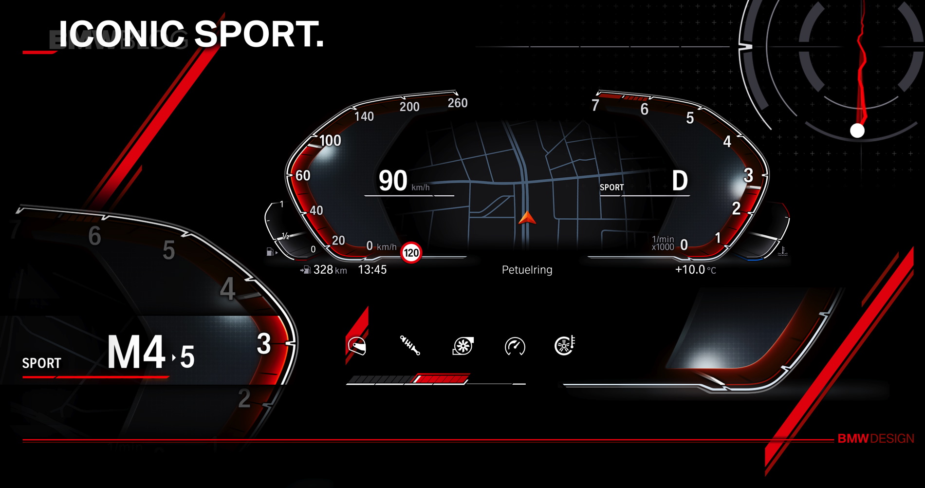
With BMW OS 7.0, which I got some hands-on time with in the latest BMW 8-series model that’s making its official debut today (and where the OS update will also make its first appearance), the company stops pretending that the screen is a standard set of gauges. Sure, some of the colors remain the same, but users looking for the classic look of a BMW cockpit are in for a surprise.
“We first broke up the classic round instruments back in 2015 so we could add more digital content to the middle, including advanced driving assistance systems,” one of BMW’s designers told me. “And that was the first break [with tradition]. Now in 2018, we looked at the interior and exterior design of our cars — and took all of those forms — and integrated them into the digital user interface of our cars.”
The overall idea behind the design is to highlight relevant information when it’s needed but to let it fade back when it’s not, allowing the driver to focus on the task at hand (which, at least for the next few years, is mostly driving).

So when you enter the car, you’ll get the standard BMW welcome screen, which is now integrated with your digital BMW Connected profile in the cloud. When you start driving, the new design comes to life, with all of the critical information you need for driving on the left side of the dashboard, as well as data about the state of your driving assistance systems. That’s a set of digital gauges that remains on the screen at all times. On the right side of the screen, though, you’ll see all of the widgets that can be personalized. There are six of those, and they range from G meters for when you’re at a track day to a music player that uses the space to show album art.
The middle of the screen focuses on navigation. But as the BMW team told me, the idea here isn’t to just copy the map that’s traditionally on the tablet-like screen in the middle of the dashboard. What you’ll see here is a stripped-down map view that only shows you the navigational data you need at any given time.
And because the digital user interface isn’t meant to be a copy of its analog counterpart from yesteryear, the team also decided that it could play with more colors. That means that as you move from sport to eco mode, for example, the UI’s primary color changes from red to blue.

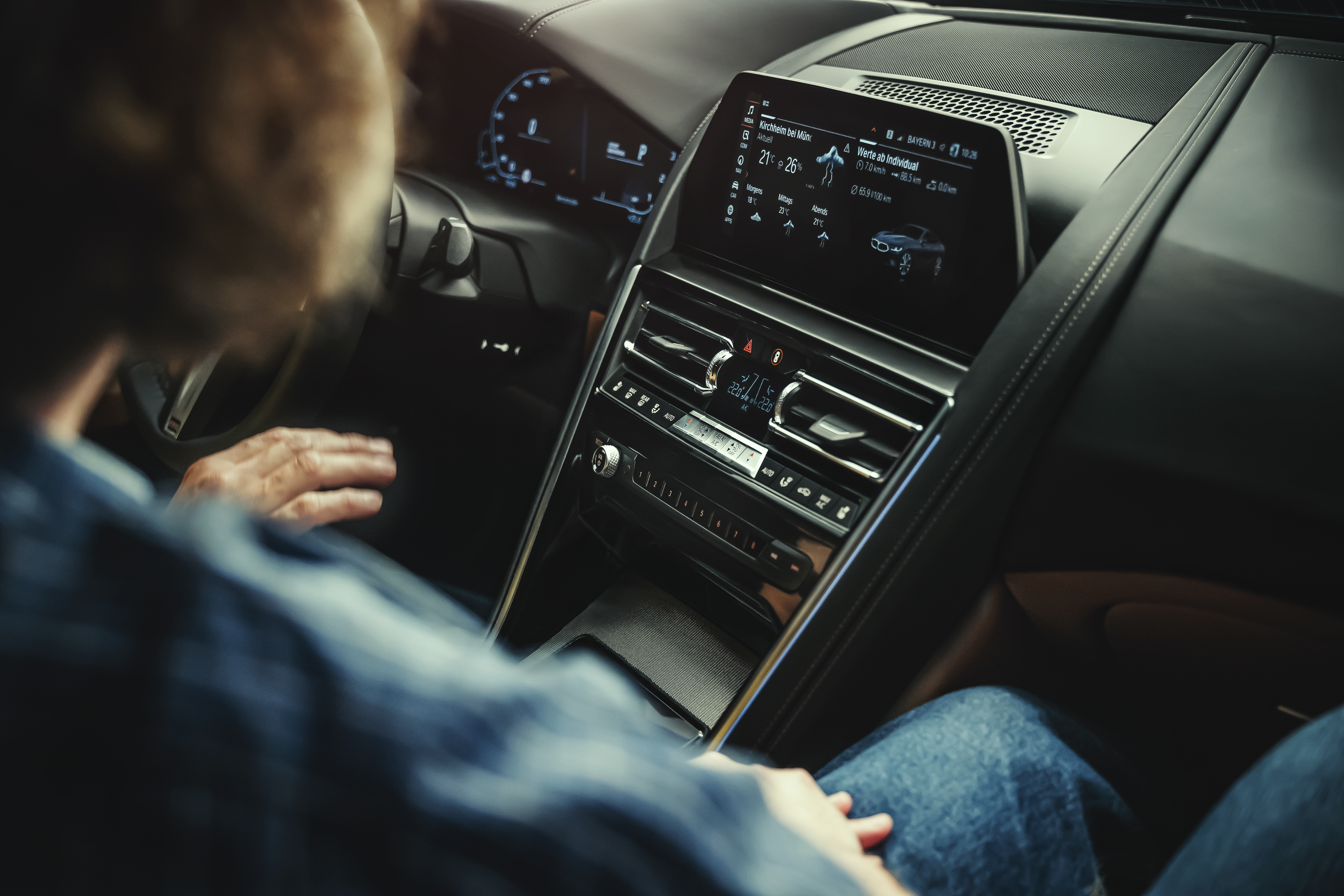
The instrument cluster is only part of the company’s redesign. It also took a look at what it calls the “Control Display” in the center console. That’s traditionally where the company has displayed everything from your music player to its built-in GPS maps (and Apple CarPlay, if that’s your thing). Here, BMW has simplified the menu structure by making it much flatter and also made some tweaks to the overall design. What you’ll see is that it also went for a design language here that’s still occasionally playful but that does away with many of the 3D effects, and instead opted for something that’s more akin to Google’s Material Design or Microsoft’s Fluent Design System. This is a subtle change, but the team told me that it very deliberately tried to go with a more modern and flatter look.
This display now also offers more tools for personalization, with the ability to change the layout to show more widgets, if the driver doesn’t mind a more cluttered display, for example.
Thanks to its integration with BMW Connect, the company’s cloud-based tools and services for saving and syncing data, managing in-car apps and more, the updated operating system also lays the foundation for the company’s upcoming e-commerce play. Dieter May, BMW’s VP for digital products and services, has talked about this quite a bit in the past, and the updated software and fully digital cockpit is what will enable the company’s next moves in this direction. Because the new operating system puts a new emphasis on the user’s digital account, which is encoded in your key fob, the car becomes part of the overall BMW ecosystem, which includes other mobility services like ReachNow, for example (though you obviously don’t need to have a BMW Connect account just to drive the car).
Unsurprisingly, the new operating system will launch with a couple of the company’s more high-end vehicles like the 8-series car that is launching today, but it will slowly trickle down to other models, as well.
