A new way to design completely customized maps
By: Dana Sulit
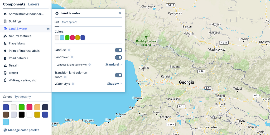
We’ve just launched Style Components in Studio to manage complex hierarchies like road network, land use, color palettes, and typography properties. Style Components provide sensible defaults and quick opportunities for customization by optimizing the most common property changes for styles and packaging them into simple drop-down options, sliders, and toggles.
https://medium.com/media/b4279d267c81d1d1909a23633d7bab85/href
Components create one control for various associated layers, ensuring consistency of colors and typography across the map.
“I can now do in eight minutes what used to take eight hours, like designing a road network on a map. You’ve made it almost too easy to style and make beautiful maps, and so much faster to tweak the map.”
— Stephen Smith, Cartographer, MapSmith
Edits affect logical groupings of features all at once with tools for overriding and customizing individual layers if needed. Here are some of the most popular components:
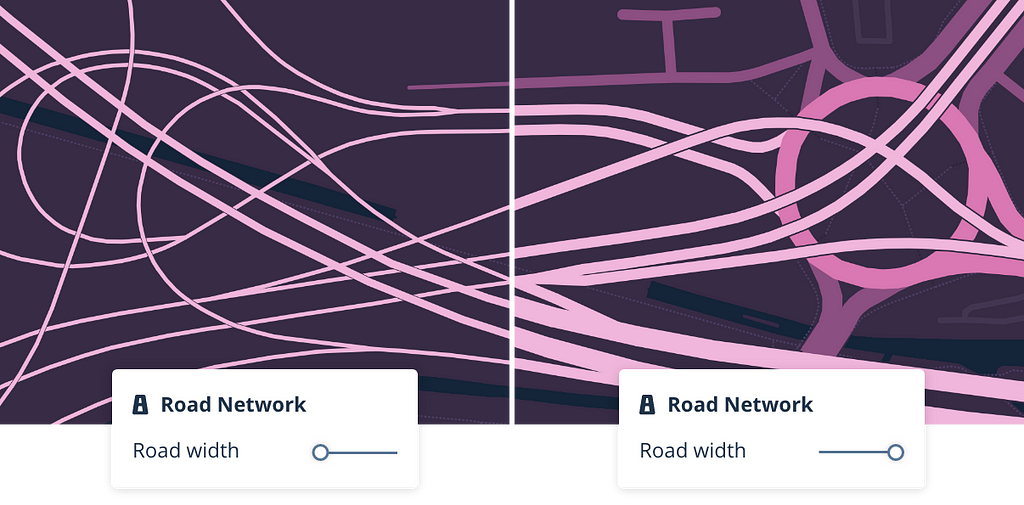
Road network: Toggle elements like shields, one-ways, and traffic. Easily adjust road width across multiple road classes and zoom levels.
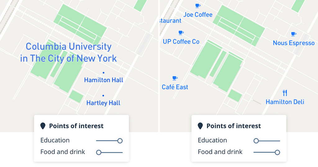
Points of interest: Tune POIs by category to emphasize campus buildings, local coffee shops, or one of 20 more categories.
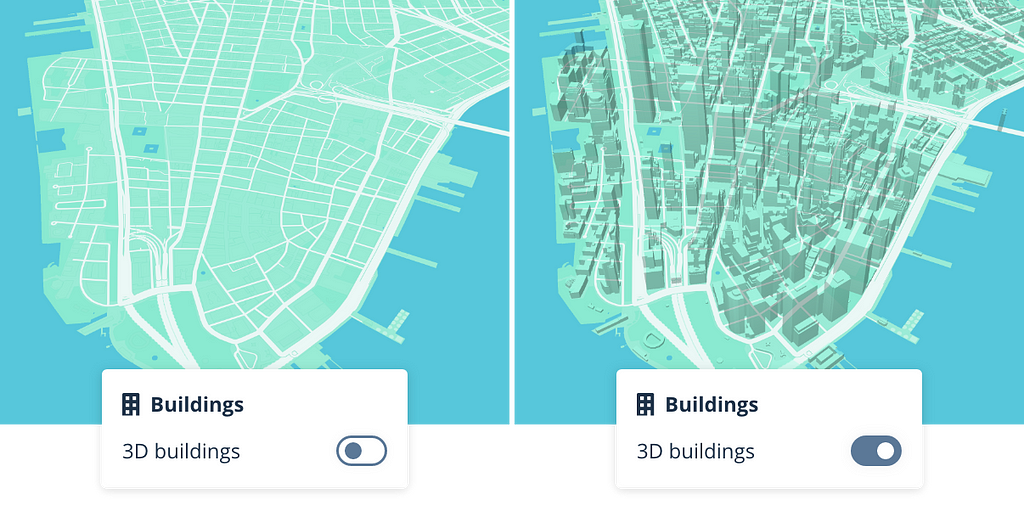
Buildings: Convert building footprints to 3D building models.
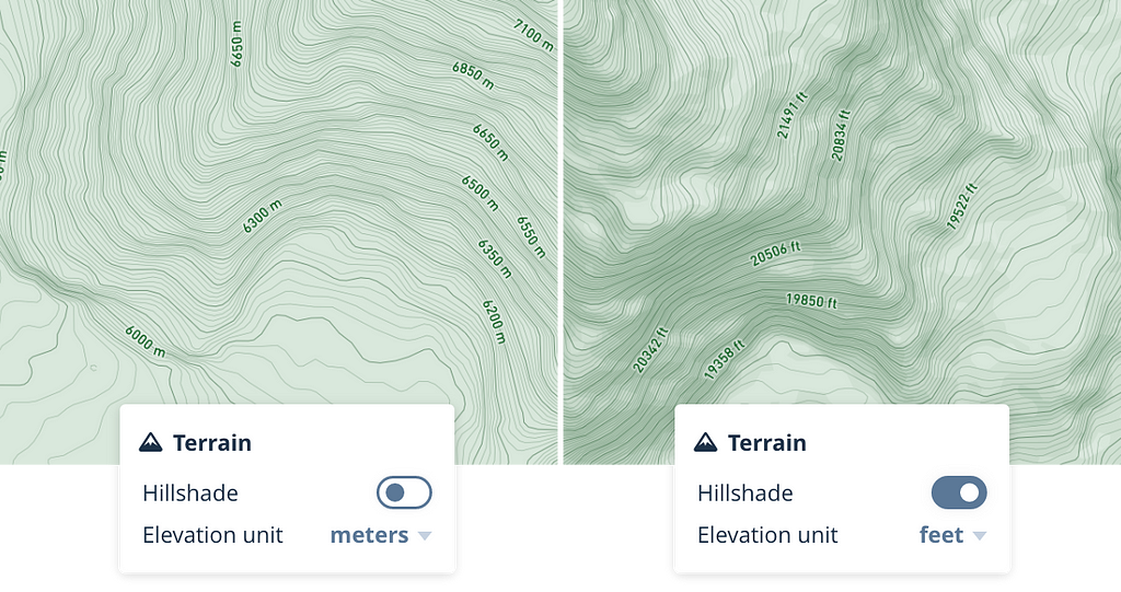
Terrain: Turn on contours, and choose labels with meters or feet depending on your audience.
Simplified color and typography editing
Color and typography are the core elements behind a unique custom style. Designers can easily create a variation of a map style with a few edits, remixing the look without having to recreate the entire map. Use these new color and typography features to apply a holistic shift to the theme.
“I loved that I could hide huge swathes of the map at once in a single click through hiding and showing Components. And the color palettes- this was really cool being able to see all the colors together in the same place and quickly edit the colors side by side to get the look I wanted.”
— Desiree Abbott, Ancestry
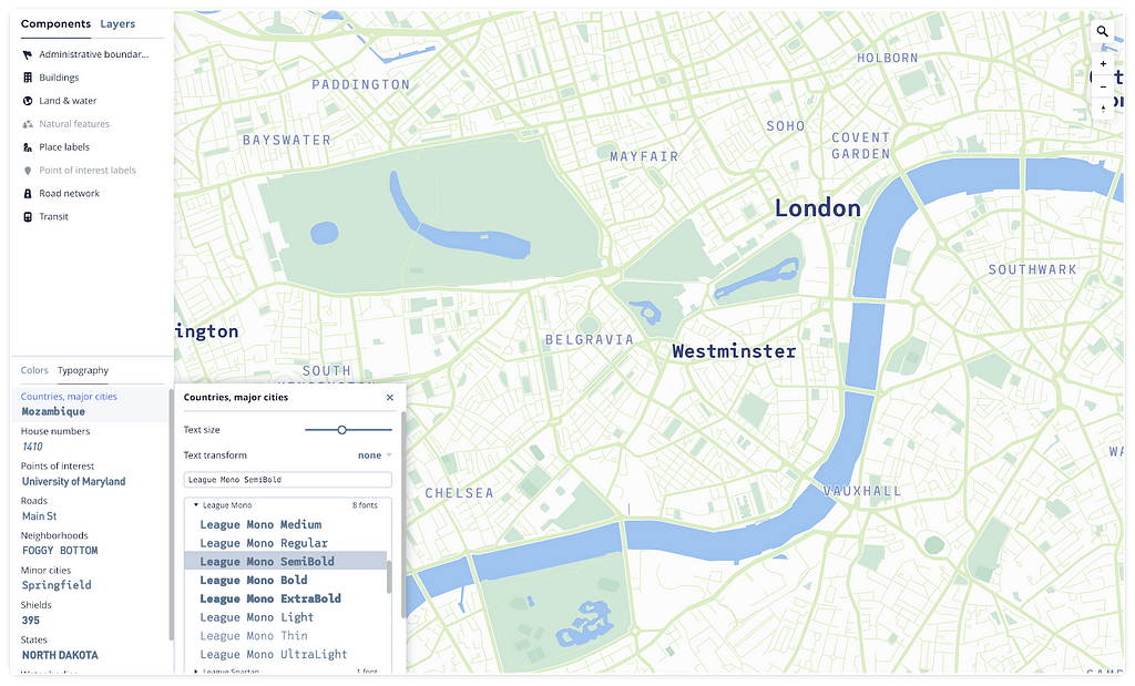
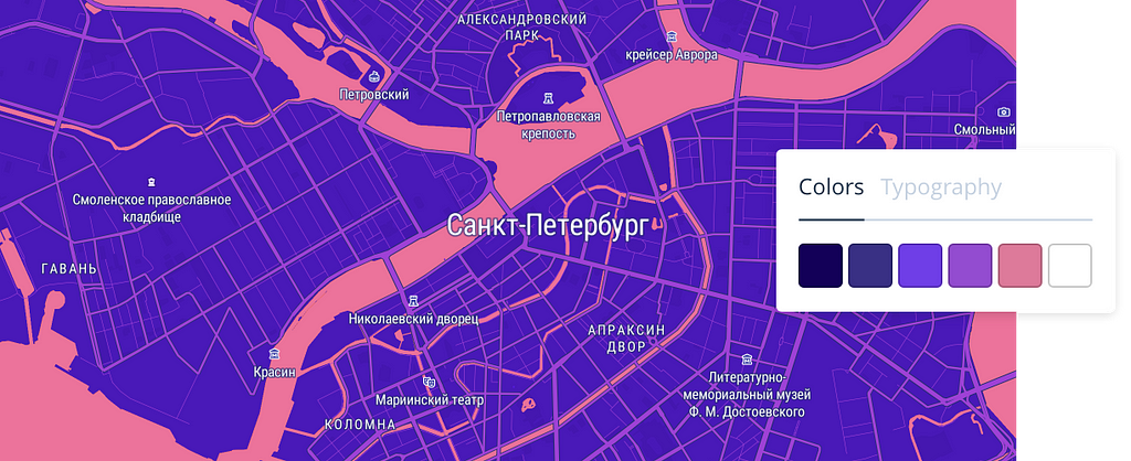
Colors: Manage colors as a palette, with each swatch intuitively applying color across complex hierarchical components like the road network.
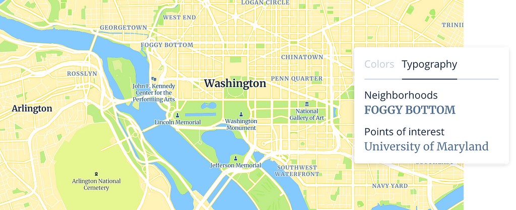
Typography: Control typefaces and text treatment across your map as part of a hierarchy.
“At a high level, one of the challenges of Studio before was that it was a little too difficult to work with for product designers who are not familiar with data. This new direction is compelling- it presents a range of styling they can do directly without having to know the data.”
— Graham Keggi, Senior Product Manager, Strava
Override properties for detailed control
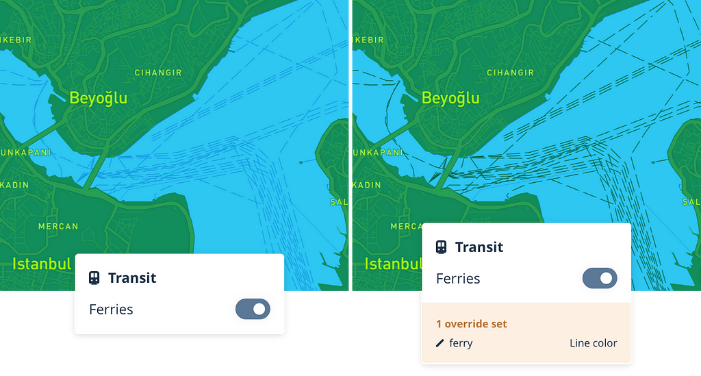
Components provide a streamlined experience for making wide-reaching changes at once, but also support deeper editing workflows. After creating a style through the new color, typography and component features, designers can customize specific details of the style through overrides. Overrides allow designers to edit just one property of a layer, without affecting the rest of the properties controlled by the component. For example, to highlight the ferry lines within the Transit component, designers can override the color property of the ferry layer.
Custom data
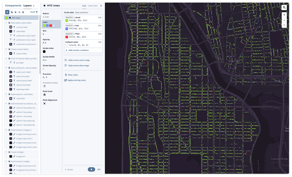
Studio supports uploading data directly into the map and generating a ready-to-style tileset. This process allows designers to add choropleths, heatmaps, custom points, and more on top of any map.
Start designing with Style Components
Style Components in Studio is now available in public beta for every user, just create a new style to take advantage of all the new features. To start building, log in to Studio or sign up for an account to start making your first map.
https://medium.com/media/f070a0cbd760698fda37c1d62b0ba5d0/href
Dana Sulit – Product Designer/Developer – Mapbox | LinkedIn
Style Components in Studio was originally published in Points of interest on Medium, where people are continuing the conversation by highlighting and responding to this story.
