2020 election mapping resources for journalists, academics, and citizens
By: Lo Bénichou
Maps can tell stories in a way that raw data can’t. That’s especially true when it comes to elections maps. In 2020, election maps will hold our attention and tell the story of our democracy through data — from visualizing live returns, to voting access, to the representation of 330 million people after the 2020 census.
That’s why today we’re launching Mapbox Elections, a resource to help individuals, journalists, and organizations cover the elections, analyze the results, and build modern maps to display it all.
To start, we’re releasing new tilesets of historical data for the 2004–2016 general presidential elections, at the state and county level. These tilesets are powered by Mapbox Boundaries and are now available to everyone in Studio. With these data-rich tilesets, developers can create visualizations that look at trends in party support and turnout throughout the years, and how they correlate with population changes — or any additional custom data (e.g. Census data) they want to analyze. Read more about the data and how to access it here.
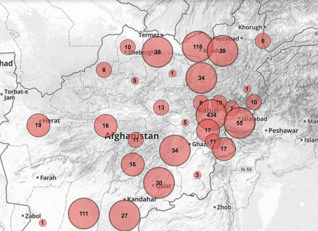
Mapbox’s roots in election mapping go back to the 2009 elections in Afghanistan. Since then we’ve developed modern mapping technology that creates opportunities for journalists and organizations to tell incredibly compelling election narratives.
These modern capabilities for processing and rendering massive amounts of data at speed, open new storytelling opportunities, and new technical challenges.
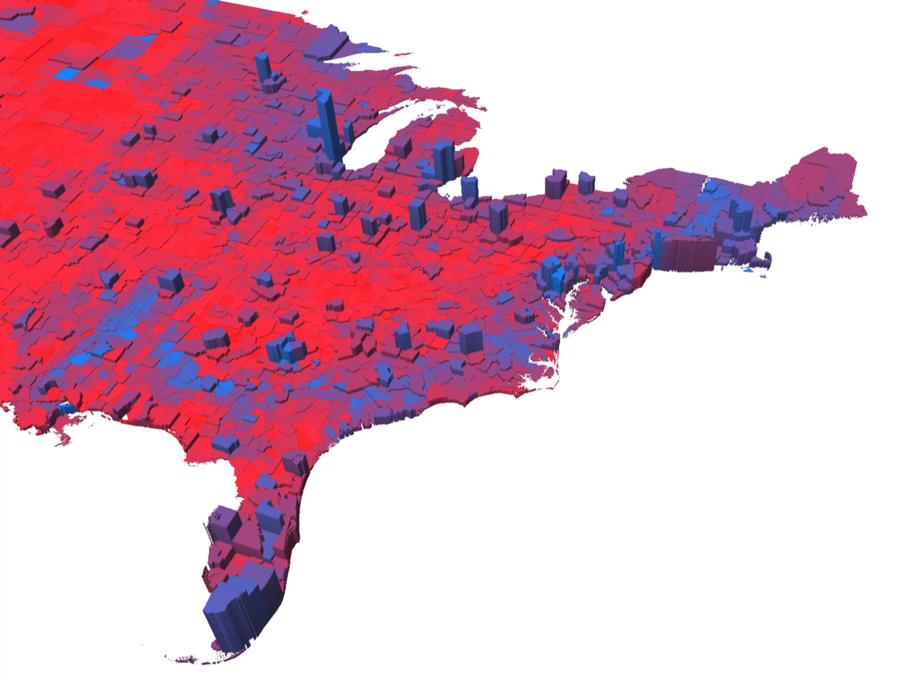
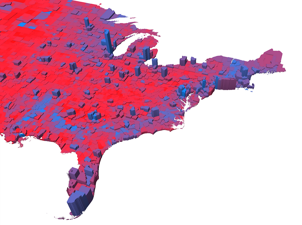
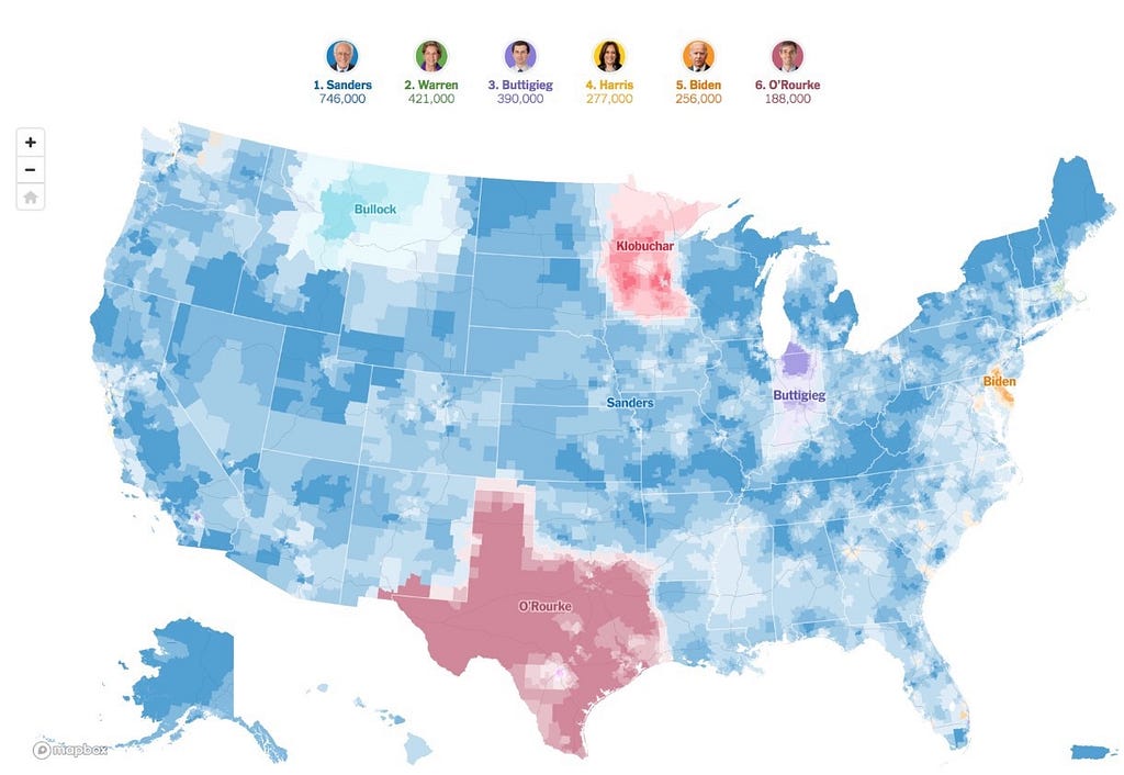
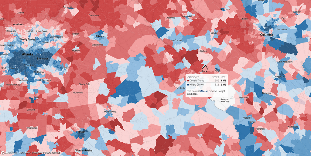
Compare the 2009 map above (visualizing the density of <1000 polling places flagged for audit in Afghanistan,) to the New York Times’ maps of 2.3 million contributions in the Democratic Primary, or their Extremely Detailed Map of the 2016 Election. For the latter, the New York Times had to source and represent the 174,000 unique geometries of every electoral precinct in the US and have them render accurately across zoom levels. Not only did the Washington Post’s 2018 election maps stream in live-updating data on election night, they did so while remaining performant with millions of hits from around the world. Mapbox’s data rendering capabilities also give builders more options to accurately represent the votes of people — not geography. (Both New York Times and Washington Post have gone into detail on this.)
Maps and stories like these are why we want to broadly share the lessons we’ve learned working with major media outlets. We’ll be adding data, tutorials, technical solutions, and other resources throughout the year. Start building your election maps and if you’d like to partner with our team on building election map resources, data pipelines, and tools, get in touch.
Launching Mapbox Elections was originally published in Points of interest on Medium, where people are continuing the conversation by highlighting and responding to this story.