And the common pitfalls to avoid
By: Kelsey Taylor
We are not epidemiologists—we are the design, engineering, and support teams at a mapping company. Just as we don’t spend every moment thinking about how to track and slow the spread of infectious disease, most public health teams we work with are not experts in spatial data visualization.
In the environment of a growing epidemic, maps have a way of spreading fast, too — making it imperative that they are accurate, informative, and thoughtfully designed. To answer common questions and help our partners make thoughtful design decisions while mapping this and other health crises, we have put together a number of best practices and common pitfalls to avoid.
Appropriate color choice
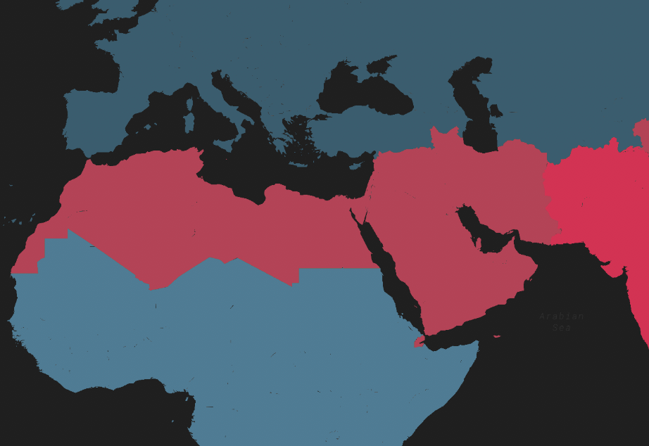
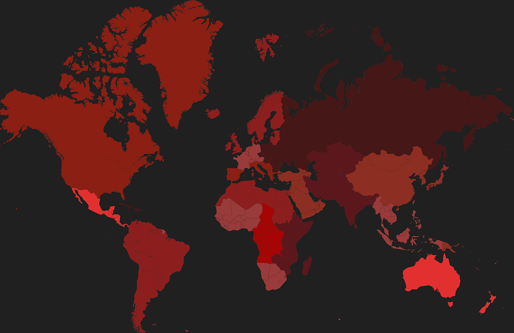
Avoid the alarmist color palette: There are many colors besides red on the spectrum.
Think about the intent of your map when choosing colors: are you trying to inform or scare your readers? Bright reds are both eye-catching and panic-inducing for most people. This color picker tool is great for identifying other color options.
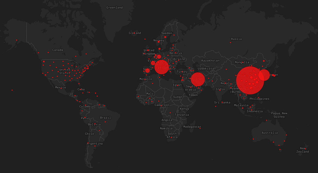
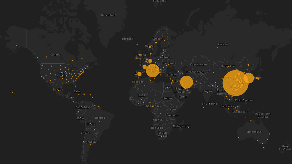
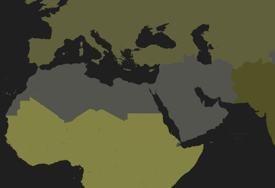
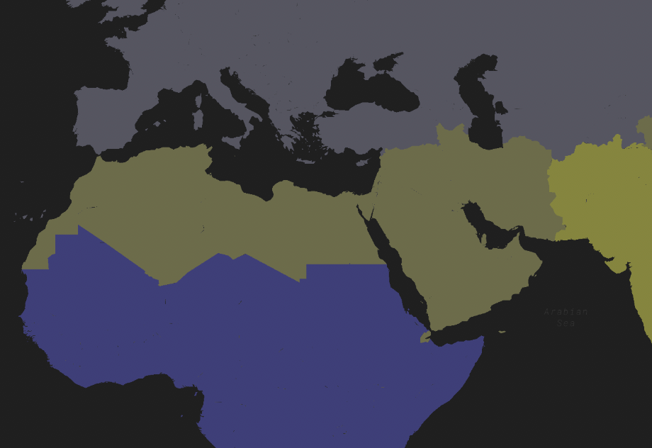
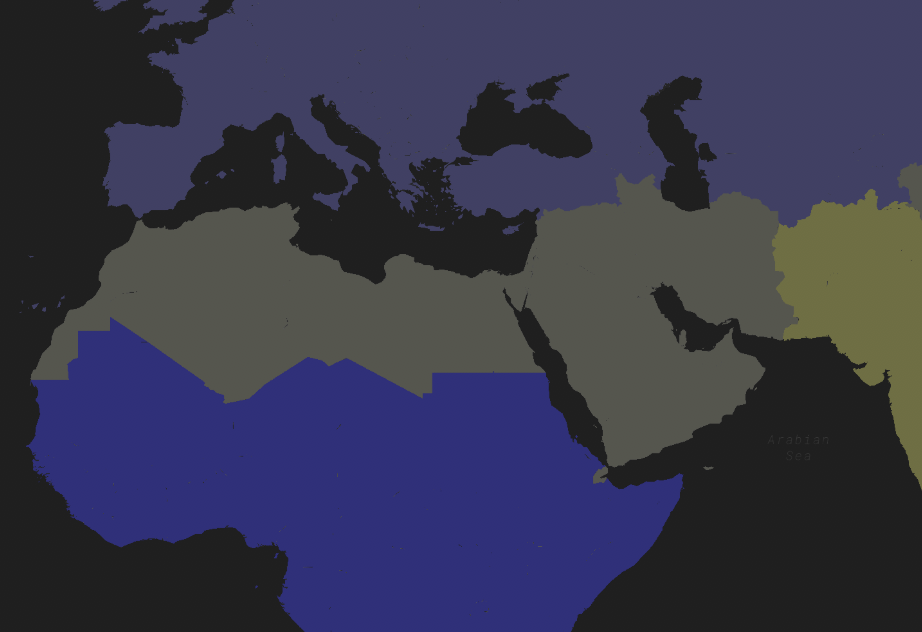
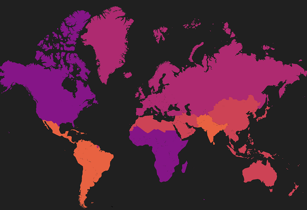
Color palettes should be colorblind-friendly: All users should be able to understand and learn from your map.
There are aesthetically pleasing, colorblind-friendly color palettes available. Color guides like this can help full-vision designers envision how color palettes will look to colorblind users. Tools like Color Oracle take this a step further by simulating various types of colorblindness on your screen.

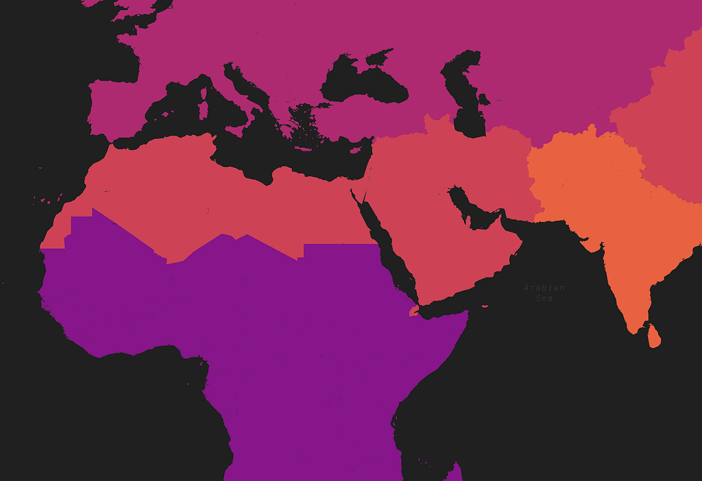
How the red-green palette looks for readers with three common forms of colorblindness: Deuteranopia, Protanopia, Tritanopia:
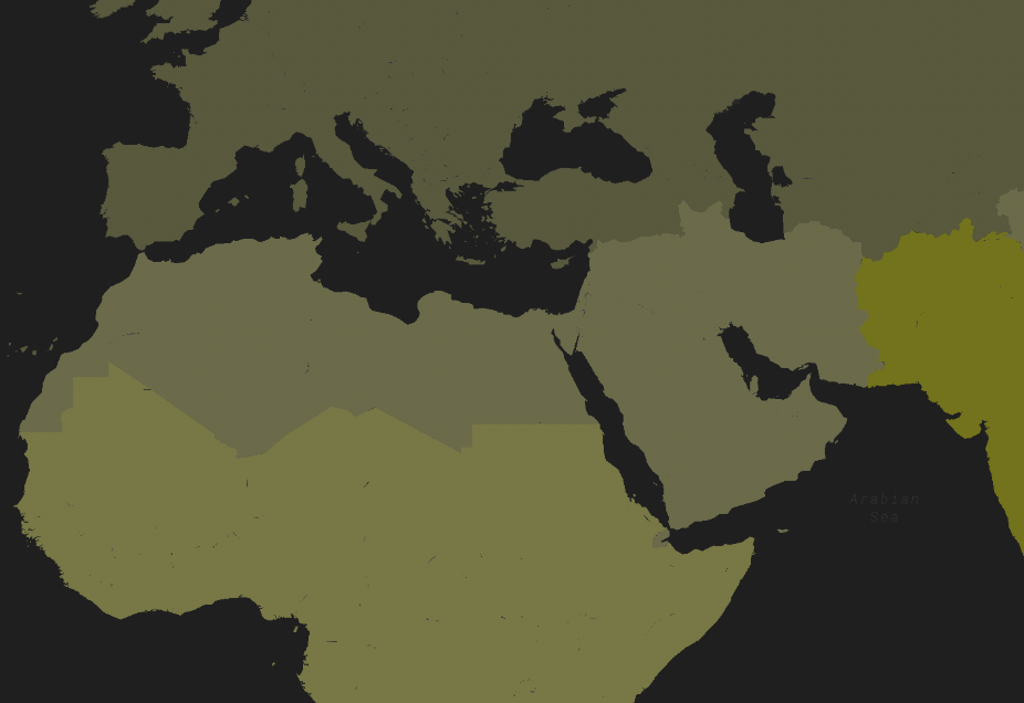
How the colorblind-friendly palette looks for readers with Deuteranopia, Protanopia, Tritanopia:
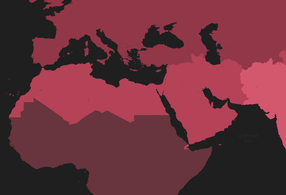
Avoid too many classes or categories: Divide your data into 5–7 classes at most.
The human eye has trouble distinguishing more than seven colors from one another at a given time. Unless your colors directly reflect the values in your data, keep the number of classes under seven.
When deciding how to class your data, think about the following questions: Is my data categorical or numeric? Do I want to display my data using a continuous or discrete color palette? ColorBrewer can help with palette selection for several data classification types.
Designing for the data you have
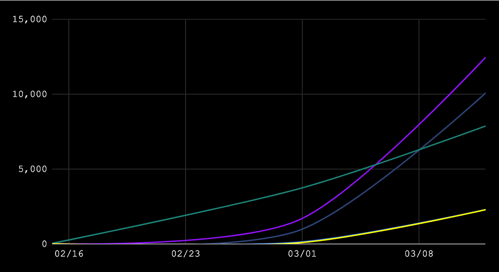
Visualize your data appropriately: Some data is better suited for a chart than a map.
Some spatial data is not well-suited for maps — and that’s okay! For example, temporal data can be hard to fit onto a map, especially if the values symbolized on your map vary greatly over time. Maps and charts are meant to complement, not necessarily replace, each other.
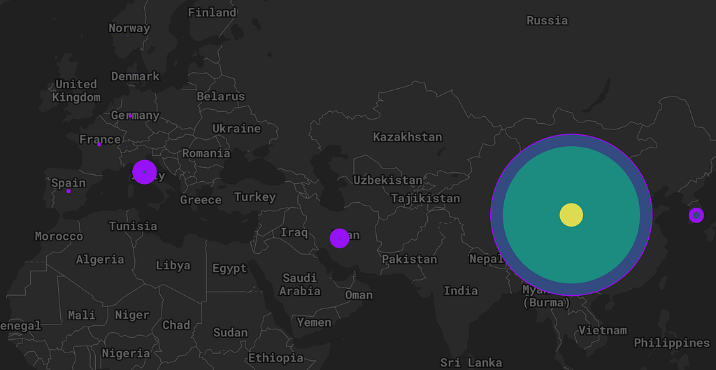
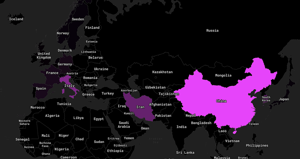
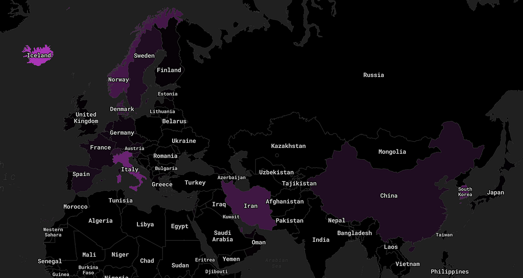
Avoid geographic distortion of your data: Rates are more meaningful than raw counts in most cases.
This is a critical point for choropleth maps of raw case numbers. Choropleths are best used to display rates (i.e. percentages) over raw values. For raw values, proportional circles are generally better than choropleths because they avoid geographic distortion.
Design with your audience in mind
Your map should tell a clear and curated story: Avoid an overwhelming amount of information.
More does not always mean better. Multiple layers displaying the same data, too many colors, and overpopulation of labels are a few of the many pitfalls that await an overzealous designer. Your map should have a narrative about your data — keep it simple where you can.
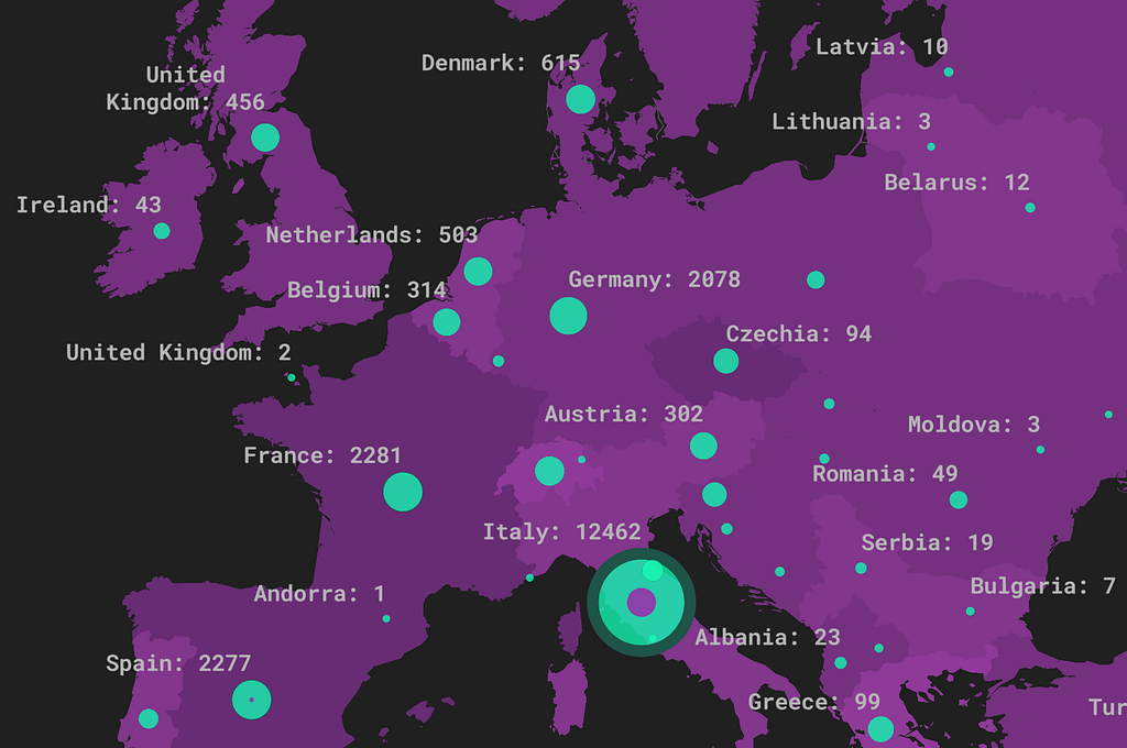
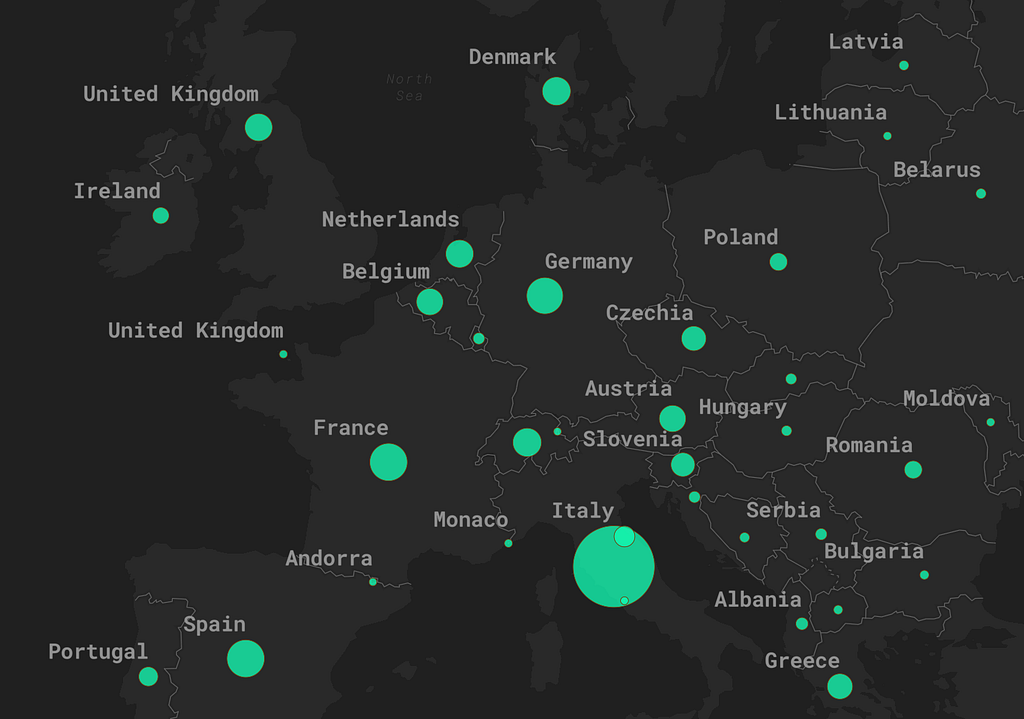
Design for many scales: Think about how your interactive map will look anywhere a user might view it.
For interactive maps, it is essential to design at many scales. Zoom dependencies are a great way to accomplish this across your entire map.
How will this map, designed at a global scale, look when zoomed to a national scale?
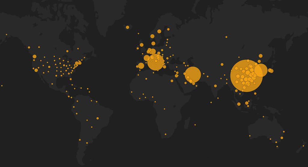
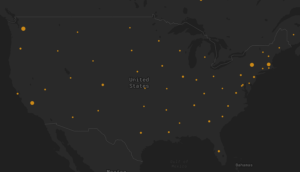
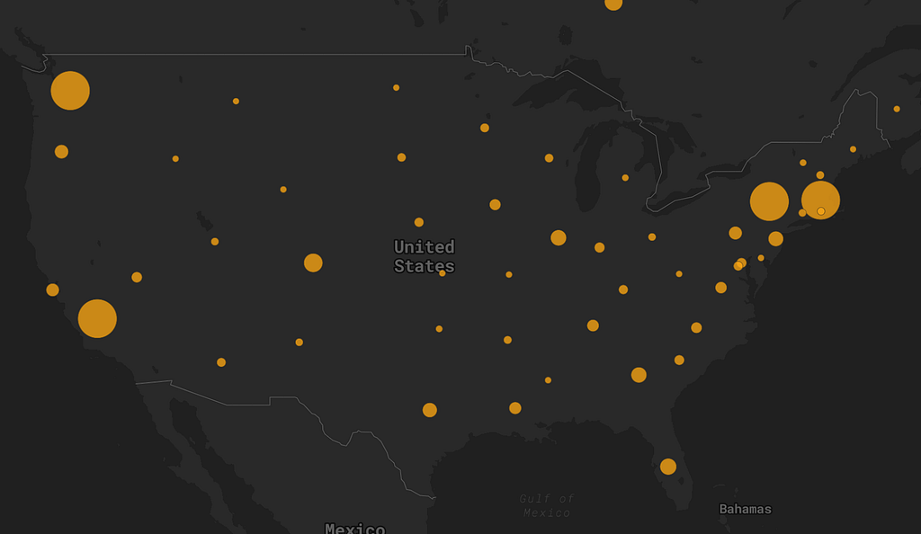
A huge thank you to all the public health officials, epidemiologists, and developers who are working so hard to share information and control the COVID-19 epidemic. We hope you find these recommendations helpful, and if you need support on your projects, reach out to our team.
Kelsey Taylor – Senior Map Designer – Mapbox | LinkedIn
Maps feature data from Mapbox and OpenStreetMap and their data partners.
7 best practices for mapping a pandemic was originally published in Points of interest on Medium, where people are continuing the conversation by highlighting and responding to this story.