How the CDC, ShareCare, and others created their COVID-19 maps
By: Jeff Butler
Diseases may not recognize borders, but administrative and political boundaries are central to how we understand and respond to disease outbreaks. Boundaries datasets provide a vital geospatial scaffolding for the analysis and visualization of disease data, at both local and global levels.
Over the course of the COVID-19 pandemic, we’ve seen a host of customers and community partners use Mapbox Boundaries to help visualize case data, coordinate response efforts, and provide information to the public. All of these customers and partners stress the importance of having access to precise and accurate boundaries. This is why we constantly update our data, with the most recent release extending coverage in Australia, Asia, and Africa by adding 150K new boundaries.
Here are six partnerships that show Boundaries in action across the world.
Centers for Disease Control and Prevention (CDC)
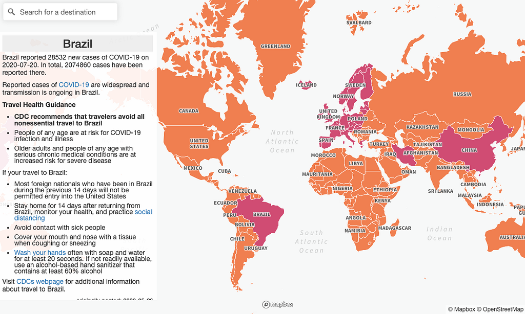
The CDC’s map of international travel notices presents the most recent health information about COVID-19, including transmission levels and restrictions on entry to the United States. By using the administrative layers in Mapbox Boundaries, the CDC has immediate access to curated, up-to-date country polygons that smoothly match each other across all regions and zoom levels.
Sharecare
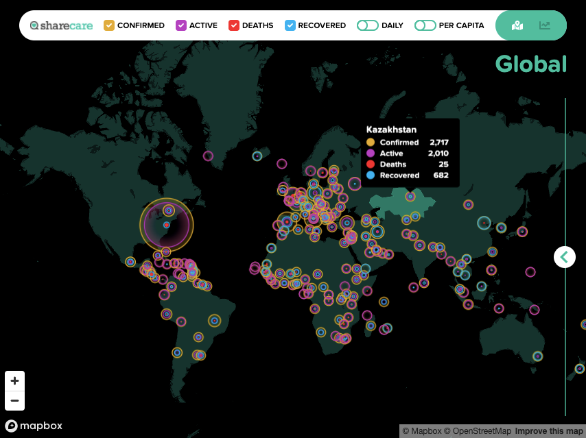
Sharecare chose Mapbox Boundaries for their custom COVID-19 case data map for two reasons: their visualizations require highly performant maps for both web and mobile, and they needed flexible licensing to add new geographies as additional data streams become available. Since Mapbox Boundaries are served through vector tiles, thousands of highly detailed administrative level polygons can be rendered without any performance degradation to enable smooth zooming through levels of data. Additionally, Sharecare uses the Points tilesets for Mapbox Boundaries to create a unique and informative circle dot visualization.
Project Lockdown
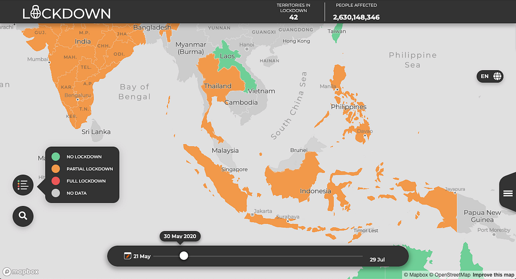
Volunteers with Project Lockdown are tracking non-pharmaceutical interventions by governments around the world to visualize the success of response measures, monitor effects on Human and Digital Rights, and clarify evaluation metrics. To create their visualization, the creators joined tabular data on lockdown status with country polygons (admin 0) from Mapbox Boundaries. Volunteers can focus their time on data collection and updates, confident that the Boundaries polygons enable a polished and easy-to-use map experience.
HealthIQ Bermuda
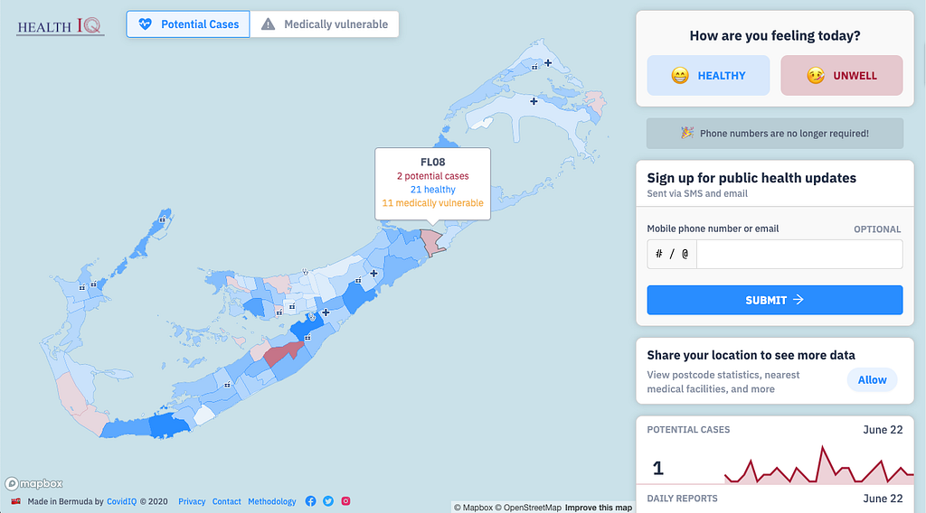
HealthIQ Bermuda uses postal boundaries to visualize crowdsourced symptom reports to help the Bermuda Health Council identify potential COVID-19 hotspots. The volunteer developers at CovidIQ.net chose to use postcodes because they are intuitive for users; however, accurate and precise polygons for Bermuda proved hard to source. Using the Mapbox Boundaries postal tileset meant the team could focus on building more dashboards for other healthcare authorities, rather than sourcing and cleaning polygons.
Covid Controls
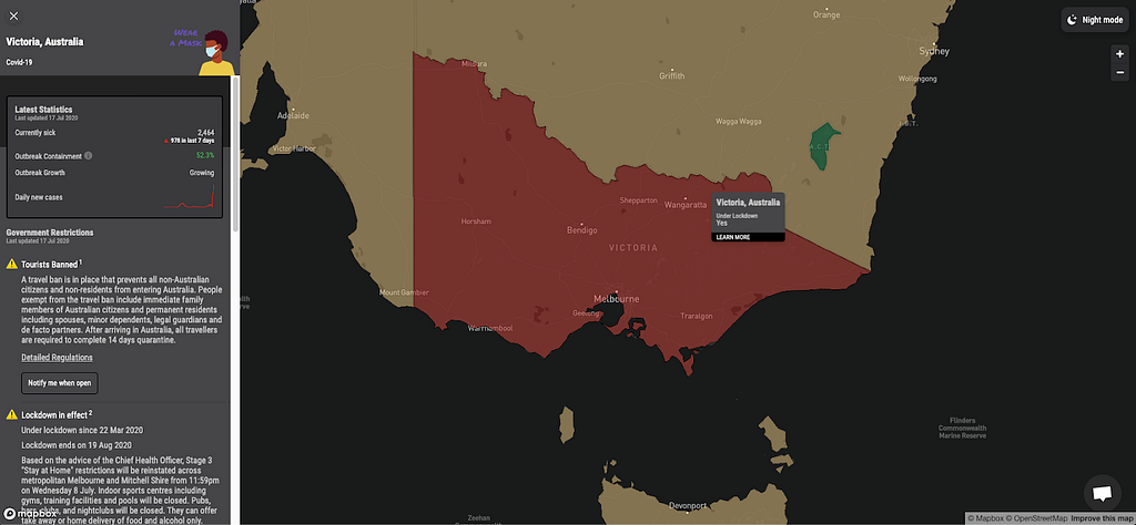
Covid Controls offers ten global map layers to visualize how countries around the world are dealing with the pandemic — visualized using Mapbox Boundaries tilesets, including sub-national details as data are collected. The tool, built by the creators of travel planning site Escape, is updated every day to help people navigate shifting Covid-19 conditions around the world — from official restrictions and the status of essential services like transportation to the latest local news stories.
byCore
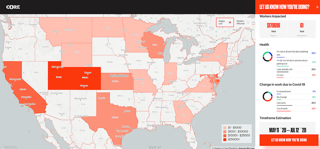
As the economic fallout of the pandemic continues to unfold, the team at byCore created a map to collect reports from construction workers about impacts on their health, work, and wages. Thanks to a dynamic data-join between the crowdsourced data and the Mapbox Boundaries tileset of US states (admin 1), the map will update as more data is contributed.
If you’re interested in building with Boundaries, you can schedule a demo with our product team, contact our sales team, or connect with the Mapbox Community team for support of a public good project.
Jeff Butler – Senior Product Manager – Location Intelligence – Mapbox | LinkedIn
Maps feature data from Mapbox and OpenStreetMap and their data partners.
Improving pandemic visualizations with Mapbox Boundaries was originally published in maps for developers on Medium, where people are continuing the conversation by highlighting and responding to this story.