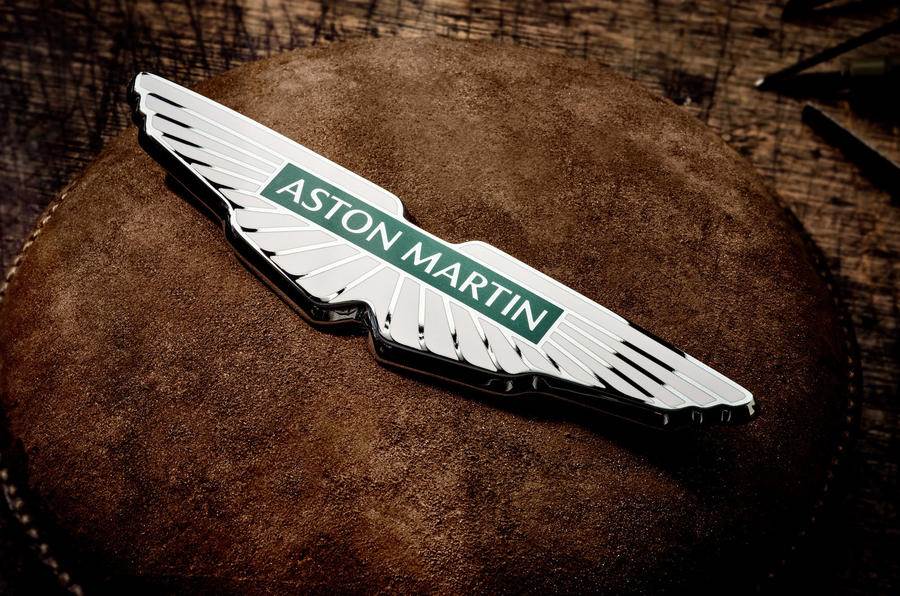
Aston Martin has revealed a new, simplified logo that it hopes can make it more appealing to a wider audience as it plots a sales uptick and ramps up to launch its first electrified models.
The British firm expects the fresh logo will allow it to enter new markets, with a specific target on affluent, global buyers, it says.
The company confirmed the new logo will not be added to the already released Aston Martin DBX 707, Aston Martin V12 Vantage or Aston Martin Valkyrie hypercar.
It is the first major update to the crest since 2003 and only the eighth time in Aston Martin’s 109-year history that it has been significantly revised. It has been unveiled as part of a new “brand expression” called ‘Intensity. Driven’. An Aston spokesman added that the logo is “celebrating the company’s position as makers of the most exquisitely addictive performance cars”.
The move comes just a week after Saudi Public Investment Fund (PIF) bought a 16.7% share in the firm as part of a £78 million deal, which also gave it two non-executive director seats on Aston’s board.

A further £575m in investment will be raised through a rights issue, which is expected to be undertaken this autumn.
Renato Bisignani, Aston’s head of global marketing and communications, said: “Building on our return to the pinnacle of motorsport in Formula 1, the launch of ‘Intensity. Driven’ marks the next phase in our evolution of the Aston Martin brand, as we unleash its global potential and maximise our unique position at the cutting-edge of ultra-luxury and high performance.”
Marek Reichman, chief creative officer, added: “Because we are designing to make people fall in love, to connect with the hearts and minds of our customers, every object we design at Aston Martin has deep meaning and intention and is created with honesty and emotion.”
The new logo was created by acclaimed graphic designer Peter Saville. The differences from the previous version include a subtle update of the iconic wings, as well as a more contemporary overall look.
Saville said: “The Aston Martin wings update is a classic example of the necessary evolution of logotypes of provenance.
“Subtle but necessary enhancements not only keep forms fresh, but allow for new technologies, situations and applications to be accommodated in the future. The process was one of clarifying and emphasising the key feature of the Aston Martin marque.”
/news-international/aston-martin-redesigns-logo-in-bid-to-appeal-to-wider-audience-92261 Aston Martin redesigns logo in bid to appeal to wider audience British car maker looks to enter new markets as it prepares to launch electrified sports cars, https://www.autocarpro.in/Utils/ImageResizer.ashx?n=http://img.haymarketsac.in/autocarpro/2d2aa7a0-0bbf-4825-99a3-e8995d4761f4.jpg
