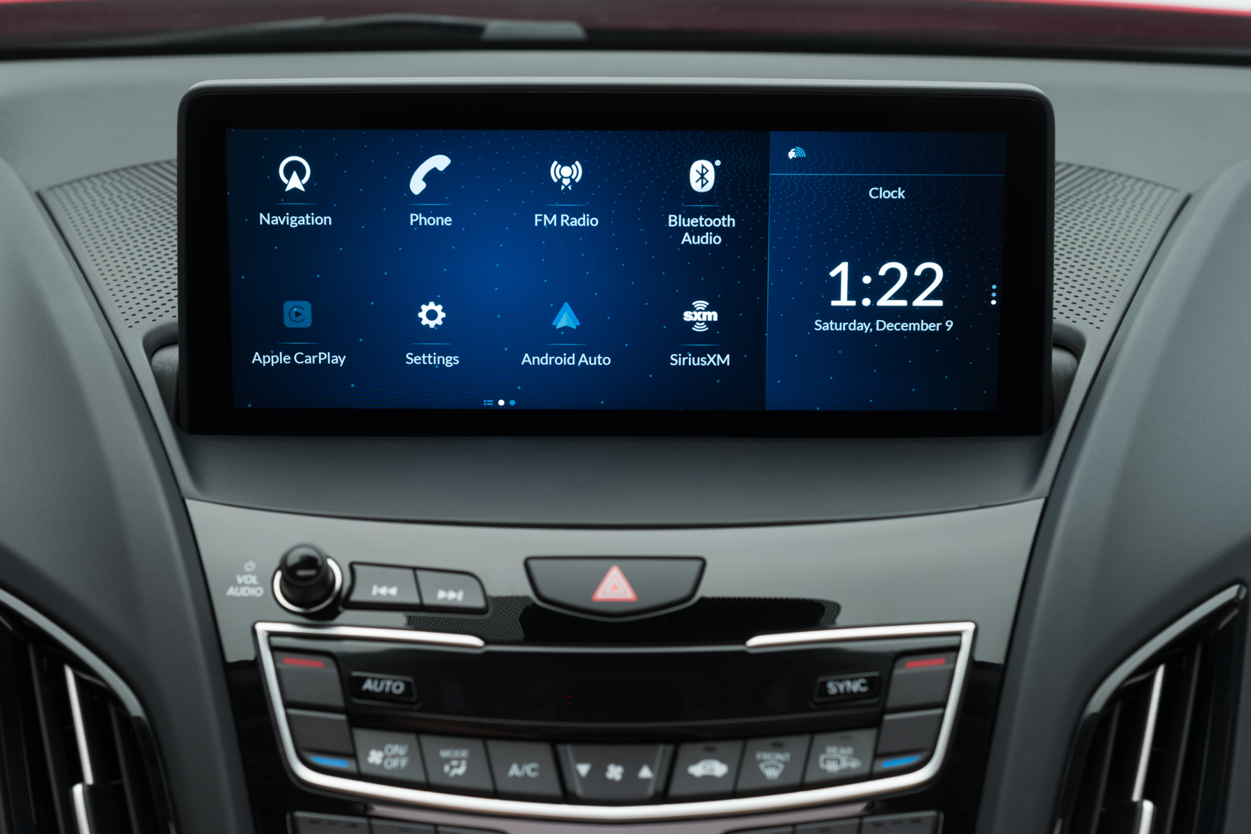
It really started with smartphones. Once we started filling our pockets with touchscreens it was only a matter of time before our fingers replaced the touchpad, mouse and stylus on almost all devices. Eventually, our digits started interacting with the infotainment systems in our cars. It makes sense, it’s easy to learn and navigate something you can poke and swipe. But is it actually the best way to navigate your car’s display? Acura has a new infotainment system built from the ground up and the one thing it doesn’t have is a touchscreen and that’s totally fine.
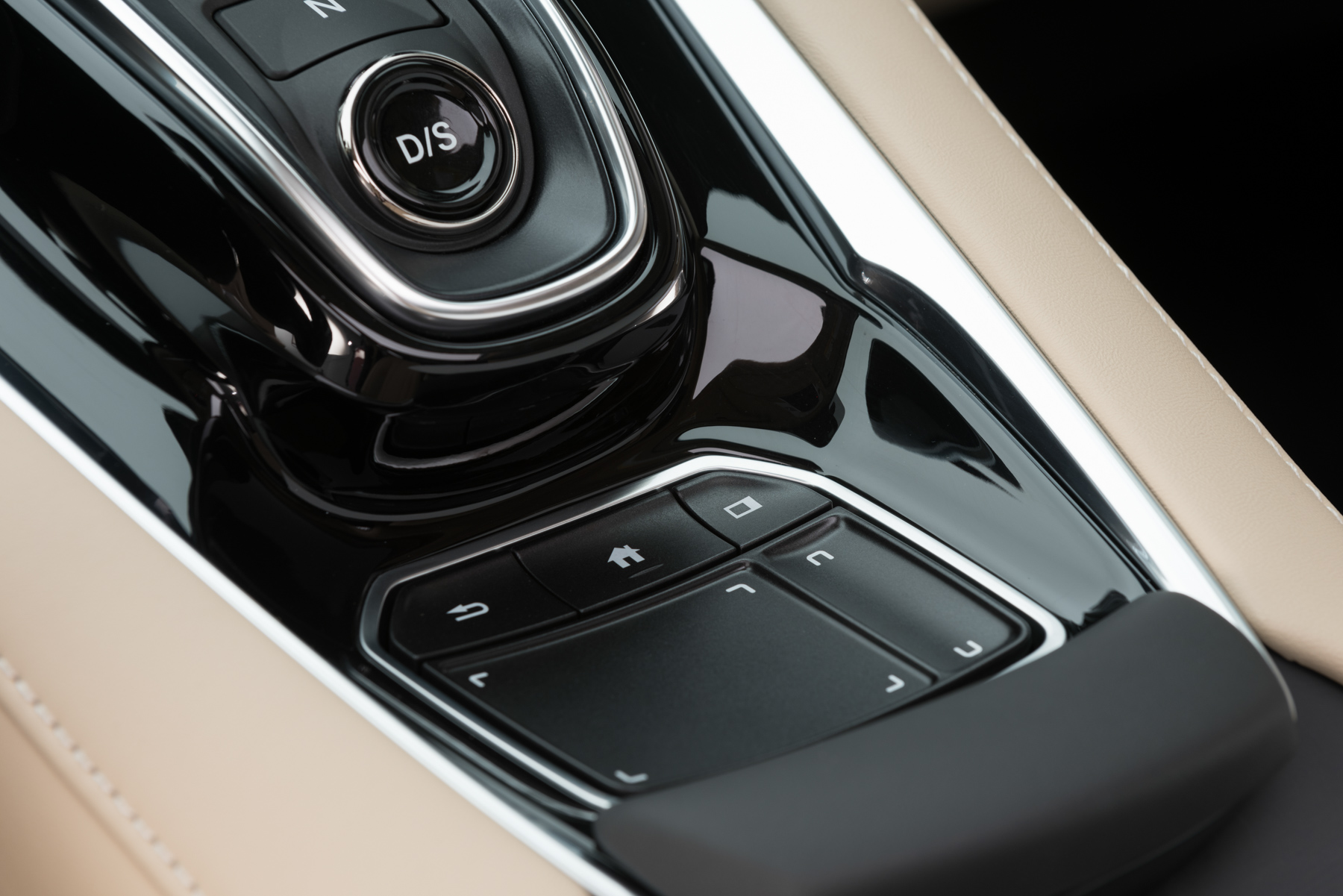
Touchpad-type interfaces aren’t new to cars but Acura has created a navigation interface it calls “absolute positioning.” The gist is that wherever my finger is on the touchpad, that’s where it is on the display. Move it to the top right corner, I’m selecting the item in the top right corner. It takes a few moments to get used to because it’s not how the touchpad on your laptop works, but once you get it, it’s actually quite convenient.

The actual input device is two pads. The usual rectangle and a secondary vertical pad directly to the right of that. Each input area controls a corresponding window on the dual screen display. The main screen could have navigation while the smaller screen handles media. You can switch the content of the screens if you want. Other cars support two screen displays, but Acura has figured out a way to make it easy to use both areas without averting your eyes from the road or hopping into submenus.
Plus, both areas are framed. This is where the system shines. Something as simple as a raised edge for these two input areas makes it easy to select the exact area on the display without looking down or moving your finger around the way you would with a mouse-controlled interface. It makes sense and within minutes I was selecting items and swapping between screens with zero issues. I could feel where I needed to be on the display.
That’s what you want from a car’s infotainment system. Something you can use without too much interference from driving and if possible without taking your eyes off the road. Acura has also pared down the amount of clutter on the display to the things people really actually use, mostly navigation and media. You can also customize the system how you want and add favorites like direct access to a contact or radio station etc.

Touchscreens are great but in cars, they introduce a host of issues. Like forcing you to look at the display instead of the road. Even when you’ve figured out where something is on the screen with a bit of muscle memory because there’s nothing tangible to actually rest your finger against so a bump or turn could result in a bad tap. The RDX’s previous system was pretty much like that except that it also looked a bit like the BIO page in Windows.
Acura isn’t the only automaker that’s using an input device besides a touchscreen. BMW, Audi and Mercedes have touchpad systems. Although Mercedes is currently in the middle of updating its in-dash set up to be more voice focused. Acura has added natural language voice control to the RDX, but it’s not as robust as what’s coming to the Benz A-Class.
During a demo drive, Acura’s principal user interface engineer Ross Miller said that the automaker didn’t just talk to people about their cars, they talked to them about dishwashers, TVs and a whole host of other items people interact with every day.
Obviously, there’s not a direct line between picking a song on your car and picking a wash cycle, but the result of those chats — and of course prototyping the system with people — is an infotainment system that’s really easy to use after a few minutes. The in-car touchscreen isn’t going anywhere, but it’s good to know that there’s an alternative out there that reminds people that there’s more than one way to pick a song and destination.
