By Scott Oldham
Walking into Dogpatch Studios on San Francisco’s east side, the Polestar 2 sits in the center of the stark industrial space, its 20-inch Continentals resting on the bare concrete floor. The all-electric hatchback sedan, which Polestar says will offer 275 miles of range, is dressed like a Stormtrooper; Snow White paint, matte black grille, dark wheels and trim.
A spinoff of Volvo, Polestar calls itself an “electric performance brand”, and the Polestar 2 will rival the Tesla Model 3. It was first revealed at the Geneva Motor Show in March, and this the first time it’s being shown in the United States. It’s striking in the flesh with tight proportions and a powerful, purposeful stance.
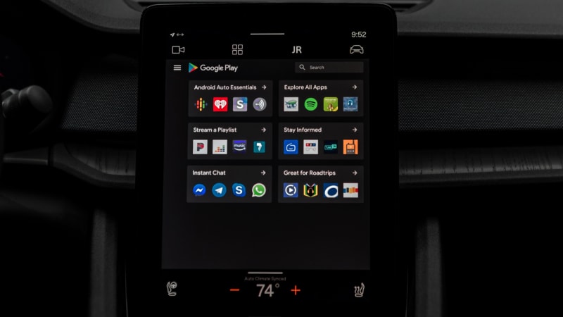
Today, however, the star of the show is inside the car. We’re here to get our first taste of the brand’s new embedded Android Automotive infotainment system that has been developed in partnership with Google, featuring Google Assistant, Google Maps and apps available in the Google Play store.
Gallery: Android Automotive in the Polestar 2 | 22 Photos
22
The system will debut in the Polestar 2 when deliveries begin this time next year. The Polestar 1, a limited production hybrid coupe, will come a few months earlier, but it will use the same system and interface used in Volvo’s current sedans and SUVs. Both cars will be built in China.
Although Google is working with many other automakers, the Polestar 2 will be the first car to get this system in its entirety. FCA, Renault, Nissan and Mitsubishi are also currently working with the tech company and will use its open source operating system in future models, however, Polestar will be the first to use its platform as well as offer its applications and services.
Audi offered Google Earth in its navigation system for years, but didn’t use Google’s platform to support it, and Haris Ramic, the lead product manager for Android Automotive, says that became a problem. “Google Earth with the operating system underneath just wasn’t scalable,” he says.
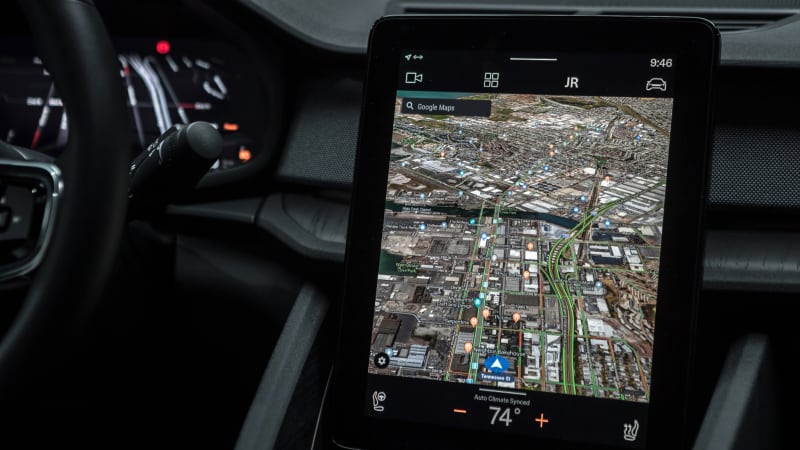
Ramic admits Tesla has been an inspiration, but the system’s entire interface was designed in house at Polestar, including all the graphics, menus and its massive 11-inch touchscreen, which replaces the car’s center stack. It’s similar to the design found in the Model 3, however, unlike the Tesla’s screen, the Polestar’s unit is mounted vertically, which Maximilian Missoni, Polestar’s Head of Design, says is better to display maps and lists.
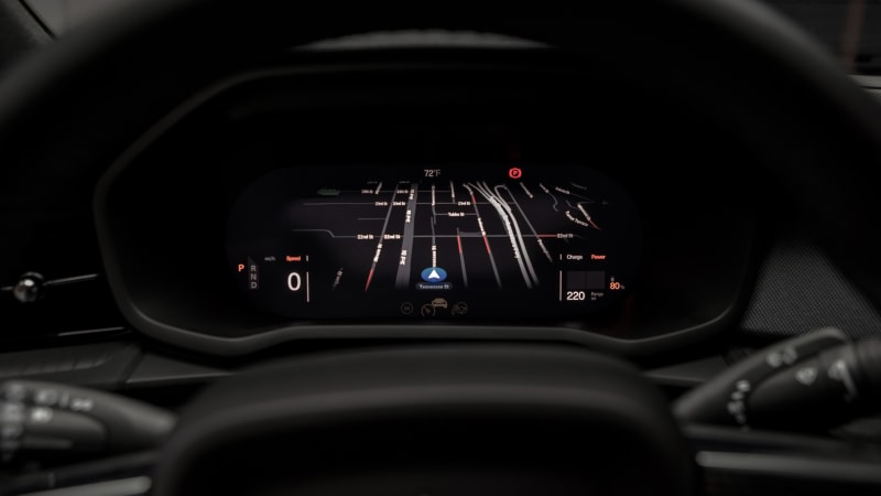
Also, unlike the Tesla, the Polestar 2 still has an instrument cluster ahead of the driver. It’s a 12.3-inch screen but there aren’t any round gauges or needled instruments, just clean digital readouts for speed, battery charge levels and other vitals. The navigation system map is also mimicked in the space and there are three configurations chosen with a button on the steering wheel; car centric, minimal and map centric.
“We call that the Now Area,” says Missoni. “It displays information the driver needs right now at a glance. The other screen is the Whenever Area and offers less important information for when the driver can afford to look away from the road.” Surprisingly, a head-up display will not be available.
Most of the magic happens in the Whenever Area. As on an Android phone or tablet, there are four large tiles on the home screen, one each for Maps, Phone, Audio and the cars battery charge consumption. Each tile scrolls within itself to reveal clusters of apps for each genre, or you can touch the tile and open it to full screen. Unlike Volvo’s current system, there is no scrolling to the side.
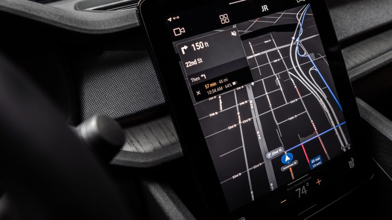
It’s well organized and the graphics are clean and colorful. And everything is big. Google says the graphics have been optimized for driving with larger “tap targets” so drivers can use the screen quickly with as little distraction as possible. The maps have also been simplified and display less detail so they’re easier to consume at a glance. Satellite view is available and the system will come equipped with FM, SiriusXM and Spotify.
The screen’s response to my touch is quick — not as fast as my iPhone 6S, but close. Polestar says the production version will be faster than this prototype. At the bottom of the screen is a virtual home button, but there isn’t a back button and that seems like an oversight. As in all Teslas and current Volvos, the Polestar’s climate controls are also housed within the touchscreen, along with other functions like settings for the car’s headlights, seats and door locks.
Google Assistant is another important part of the package, and it may be the best voice command system we’ve tried — but it’s not perfect. During our 20 minutes inside the car a Google product manager, quickly starts throwing commands at the system’s AI. “Ok Google,” she says. “Take me to Monterey.” Within about two seconds the screen reveals a route and the trips distance in miles in relation to the car’s current state of charge. It’s close enough that no recharging would be required to cover the distance.
“Ok Google,” I say. “Take me to Los Angeles.” To my surprise the system understands my New Jersey accent perfectly and quickly displays a route complete with charging stations along the way.
Then she says, “Ok Google, play ‘At Last.'” One Mississippi, two Mississippi, three Mississip… Etta James has been found on Spotify and her soulful vocals are coming filling the cabin. And then we hit a small glitch. “Ok Google,” she says. “Turn up the volume.”
No response.
“Ok Google, turn up the volume.” Nothing. She changes the language of the request. “Ok Google, increase the volume.” This time it works, but the volume increase is small. Missoni must like his tunes cranked. He kept a large volume knob on the Polestar’s console and volume buttons on the steering wheel, which is shared with the Volvo XC40 along with the sedan’s platform.
In another smart move, the system will support Apple CarPlay, which will be wireless. The entire system will system will also be personalized to the driver, recognizing you from your smartphone and remembering all your settings and favorites. “In the future your identity will come with you,” says Ramic.
Your smartphone will also act as the cars key, unlocking the doors from within two meters and the ignition from the driver’s seat. Buyers will also get a traditional key fob for valets and a waterproof activity key.
Although the system is impressive and its interface is clean and well thought out, it doesn’t seem to break any new ground from a function or feature standpoint. It all seems kinda familiar. In fact, if you’ve used Android Auto then you’ve probably used Google Assistant in your car before. The difference is it was through your phone, which had to be plugged into the car, here the system is embedded into the car.
Ramic says there will be regular over the air updates, and the real innovation will come from third party media application developers. At this point, however, there haven’t been any apps approved for the automotive system and the guidelines are still in progress. YouTube is called out as an example of an app that wouldn’t qualify, as watching videos while driving would be clearly dangerous.
Polestar is now taking deposits for the Polestar 2, as well as the Polestar 1 and the cars will be sold through standalone stores. “This car will never be in a Volvo showroom,” says the brand’s COO. The Polestar 3, a coupe-style SUV, will get a new platform. It will also debut the brand’s next design language, inside and out, which will separate it further from Volvo’s offerings. It’ll arrive in the backend of 2021.
In this article: Android, Android Automotive, gear, google, Google Assistant, partner, polestar, polestar 2, Syndicated, transportation, volvo

By Autoblog
117 Shares
Share
Tweet
Share
Save
Comments


