What you need to know to prepare and recreate your styles By: Josh Erb This spring, we’re deprecating Studio Classic map styles and supporting users in moving over to our modern Static Images and Static Tiles API for improved performance and more control over styling. We’ll be slowly rolling out this deprecation to give users time to migrate… Continue reading Deprecating Studio Classic styles
Author: Mapbox Official_News
7 best practices for mapping a pandemic
And the common pitfalls to avoid By: Kelsey Taylor We are not epidemiologists—we are the design, engineering, and support teams at a mapping company. Just as we don’t spend every moment thinking about how to track and slow the spread of infectious disease, most public health teams we work with are not experts in spatial data visualization.… Continue reading 7 best practices for mapping a pandemic
WordPress adds map block
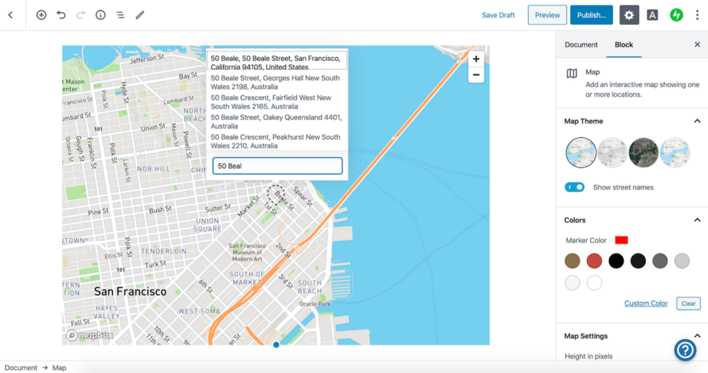
1/3rd of the internet can now add custom maps in a few clicks By: Chihuei Liu 450,000,000 websites or 36% of the internet can now add a map with a few clicks and no code on WordPress. The map block lets WordPress users chose between four preset map styles, and uses the Geocoding API to add markers… Continue reading WordPress adds map block
Deferred payment until Q4 for travel and tourism companies impacted by COVID-19
Map Source: EpiRisk By: Peter Sirota All travel and tourism apps can defer payment until Q4 for any use of Mapbox, no matter the costs and no matter the API. We see the ripple effect the pandemic is having on the economy and our customers in real time — especially the decrease in travel across the globe. In moments like… Continue reading Deferred payment until Q4 for travel and tourism companies impacted by COVID-19
Collaborating with the Geospatial Information Authority of Japan

日本語題: 国連ベクトルタイルツールキットと日本でコラボレーション By: Allan Walker Hidenori Fujimura, a developer at Geospatial Information Authority of Japan (GSI) of Japan, is using Mapbox open-source vector-tile libraries to enable the United Nations to add geospatial context to disaster response and disaster risk management efforts worldwide. 国土地理院の藤村英範氏は、Mapboxがオープンソースとして提供するVector tileライブラリを利用して、国連における全世界的な災害対応や災害リクス管理のための地理空間情報に新たな多様性を提供しています。 Mapping in JapanWith a 150-year history, the Geospatial Information Authority of Japan… Continue reading Collaborating with the Geospatial Information Authority of Japan
Mapping the US elections: Guide to Albers USA projection in Studio
Albers USA in Studio By: Lo Bénichou This is part one of a guide series on US electoral maps and data visualization. Make sure to look out part two (coming soon), on using the Feature State API and Albers USA to join your data on the fly. We recently released an Albers USA map style featuring all 50… Continue reading Mapping the US elections: Guide to Albers USA projection in Studio
Using Boundaries for election analysis
New data analysis possibilities with Congressional and State Legislative districts, now in Mapbox Boundaries By: Jeff Butler Blue states, red counties, swing districts. Election maps rely on boundaries to quickly synthesize and translate complex election data. Whether counting vote totals or analyzing electoral shifts, interpreting the data relies on aggregating it by geographic areas. 2020 will… Continue reading Using Boundaries for election analysis
Launching Mapbox Elections
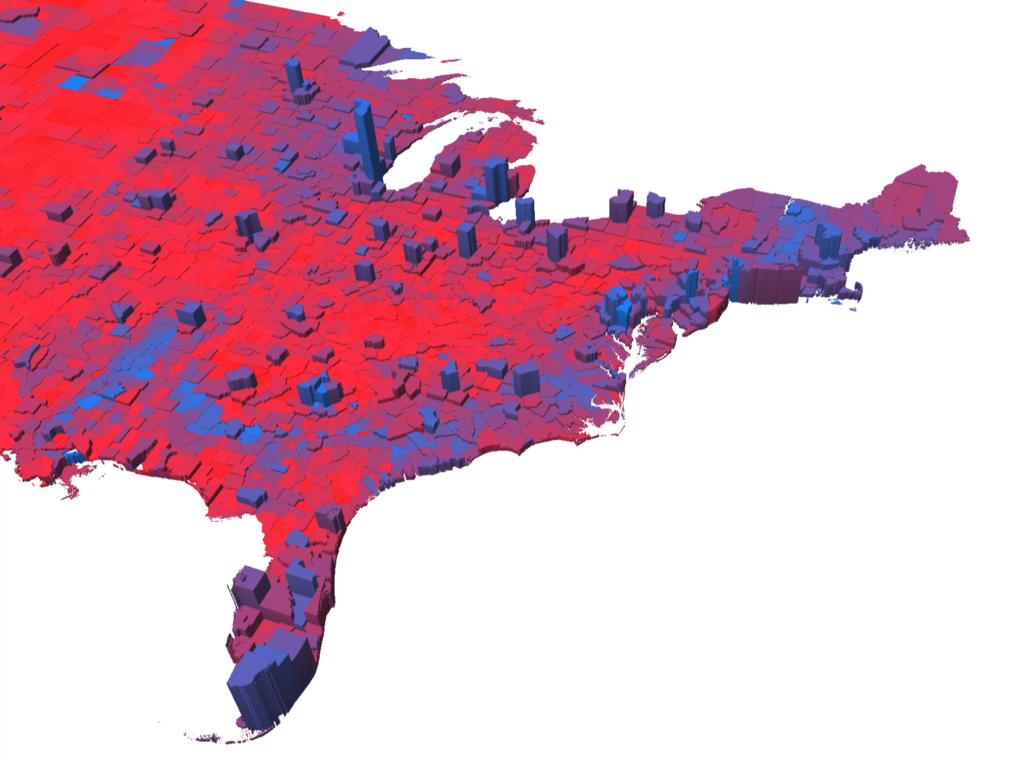
2020 election mapping resources for journalists, academics, and citizens 2016 presidential returns by county, extruded by vote total and colored by vote margin. From historical presidential elections tileset. By: Lo Bénichou Maps can tell stories in a way that raw data can’t. That’s especially true when it comes to elections maps. In 2020, election maps will hold… Continue reading Launching Mapbox Elections
Mini Tokyo 3D: A real-time 3D map of public transportation in Tokyo
Mini Tokyo 3D: 東京の公共交通のリアルタイム3Dマップ Mini Tokyo 3D: https://nagix.github.io/mini-tokyo-3d/ By: Ben Truscello 2020 is an Olympic year, and a number of programs and projects have launched in Tokyo to make this big event a success. The Open Data Challenge for Public Transportation in Tokyo is one of the interesting open data projects attracting a lot of… Continue reading Mini Tokyo 3D: A real-time 3D map of public transportation in Tokyo
Stanford Education Opportunity map

Seeing beyond test scores by visualizing the shifting landscape of education access By: Megan Danielson The Educational Opportunity Project (EOP), a research initiative at Stanford University, recently published an interactive visualization of the Stanford Education Data Archive (SEDA): a comprehensive, national database of academic performance. The database houses over 8 years of data, covering 350… Continue reading Stanford Education Opportunity map